English
Custom tabBar components.
On the applet and app side, to improve performance, configure a fixed native tabBar in pages.json. But on the H5 side, this design does not improve performance.
At the same time, H5 side, especially PC widescreen, has more flexible requirements for the location and style of tabBar. tabBar, as the first level navigation, is more often placed at the top of PC webpage than at the bottom.
The custom tabBar component came into being as needed. It still reads the tabBar information configured in pages.json, but it can customize the location and configure various css flexibly.
This component supports the related configuration of tabBar in pages.json (compatibility is consistent with H5), and the configuration of borderStyle is not supported.
This component supports all tabBar related APIs, such as setting the tab logo, displaying the red dot, and switchTab.
Platform compatibility
Only supported on the H5 side,HBuilderX 2.9.9+.
HarmonyOS
| HarmonyOS |
|---|
| x |
Attribute description
| Attribute name | Type | Defaults | Instruction |
|---|---|---|---|
| direction | String | horizontal | Arrangement direction of items, options include: horizontal, vertical |
| show-icon | Boolean | false | Whether to display icon? |
| selected | Number | 0 | Checked tabBar option index value |
| onTabItemTap | EventHandle | Click the event with the parameter of Object. See the table below for details |
Description of onTabItemTap parameter:
| Attribute | Type | Instruction |
|---|---|---|
| index | String | The serial number of the clicked tabItem, starting from 0 |
| pagePath | String | The page path of the clicked tabItem |
| text | String | The buttom text of the clicked tabItem |
This component does not need to configure the list of tabBar, each tabItem is still read from pages.json. Avoid writing the duplicated codes at multiple sides.
Example
In hello uni-app, place a custom tabBar component in topWindow, and place the page-level navigation at the top of the page.
<!-- This example does not include the complete css, please refer to the above to obtain the external css. View it in the top-window of hello uni-app project -->
<template>
    <view>
        <custom-tab-bar direction="horizontal" :show-icon="false" :selected="selected" @onTabItemTap="onTabItemTap" />
    </view>
</template>
Sample experience: Open https://hellouniapp.dcloud.net.cn/ with PC browser
Obtain source code: build a new uni-app project with HBuilderX 2.9.9+ and above version, and select the hello uni-app template.
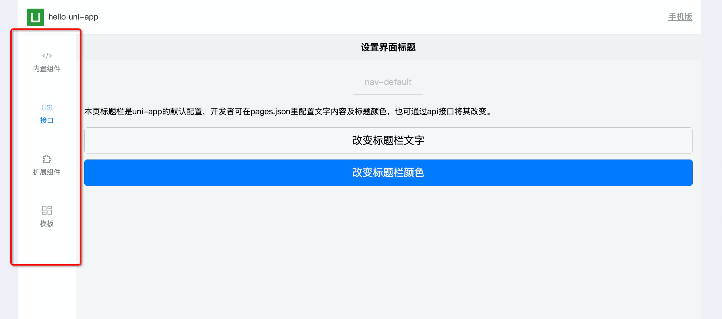
See the screenshot below for display effect:
custom-tab-bar horizontal layout (horizontal):
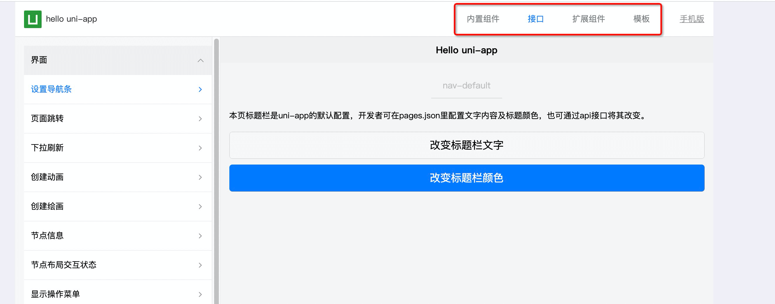
custom-tab-bar vertical layout (vertical):