English
The pages.json file is used to configure uni-app globally, to determine the path of the page file, window style, native navigation bar, native tabbar at the bottom, etc.
The height of the navigation bar is 44px (excluding the status bar), and the height of the tabBar is 50px (excluding the safe area).
It is similar to the page management part of app.json in the WeChat MiniApp. Note that the application for location permissions and other content that originally belonged to app.json are configured in the manifest in uni-app.
| Attribute | Type | Required | Description | Platform Compatibility |
|---|---|---|---|---|
| globalStyle | Object | No | Set the window performance of the default page | |
| pages | Object Array | Yes | Set page path and window performance | |
| easycom | Object | No | Component automatic import rules | 2.5.5+ |
| tabBar | Object | No | Set the performance of the bottom tab | |
| condition | Object | No | Startup mode configuration | |
| subPackages | Object Array | No | Subpackage loading configuration | H5 not supported |
| preloadRule | Object | No | Subpackage pre-download rules | WeChat MiniApp, Alipay MiniApp |
| workers | String | No | Directory for placing Worker code | WeChat MiniApp, Alipay MiniApp |
| leftWindow | Object | No | The left window of the big screen | H5 |
| topWindow | Object | No | The top window of the large screen | H5 |
| rightWindow | Object | No | The right window of the large screen | H5 |
| uniIdRouter | Object | No | Automatic jump related configuration, added in HBuilderX 3.5.0 | |
| entryPagePath | String | No | Default startup homepage, added in HBuilderX 3.7.0 | WeChat MiniApp, Alipay MiniApp, Douyin MiniApp |
Here is a pages.json with all configuration options:
{
	"pages": [{
		"path": "pages/component/index",
		"style": {
		}
	}, {
		"path": "pages/API/index",
		"style": {
		}
	}, {
		"path": "pages/component/view/index",
		"style": {
			"navigationBarTitleText": "view"
		}
	}],
	"condition": { //模式配置,仅开发期间生效
		"list": [{
			"name": "test", //模式名称
		}]
	},
	"globalStyle": {
		"navigationBarTextStyle": "black",
		"navigationBarBackgroundColor": "#F8F8F8",
		"backgroundColor": "#F8F8F8",
		"usingComponents":{
			"collapse-tree-item":"/components/collapse-tree-item"
		},
		"renderingMode": "seperated", // 仅微信小程序,webrtc 无法正常时尝试强制关闭同层渲染
		"rpxCalcMaxDeviceWidth": 960,
		"rpxCalcBaseDeviceWidth": 375,
		"rpxCalcIncludeWidth": 750
	},
	"tabBar": {
		"color": "#7A7E83",
		"selectedColor": "#3cc51f",
		"borderStyle": "black",
		"backgroundColor": "#ffffff",
		"height": "50px",
		"fontSize": "10px",
		"iconWidth": "24px",
		"spacing": "3px",
		"list": [{
			"pagePath": "pages/component/index",
			"iconPath": "static/image/icon_component.png",
			"selectedIconPath": "static/image/icon_component_HL.png",
			"text": "组件",
       			"text": "\ue102",
        		"selectedText": "\ue103",
        		"fontSize": "17px",
        		"color": "#000000",
        		"selectedColor": "#0000ff"
      		}
		}, {
			"pagePath": "pages/API/index",
			"iconPath": "static/image/icon_API.png",
			"selectedIconPath": "static/image/icon_API_HL.png",
		}],
		"midButton": {
			"width": "80px",
			"height": "50px",
			"iconPath": "static/image/midButton_iconPath.png",
			"iconWidth": "24px",
			"backgroundImage": "static/image/midButton_backgroundImage.png"
		}
	},
  "easycom": {
    "autoscan": true, //是否自动扫描组件
      "^uni-(.*)": "@/components/uni-$1.vue"
    }
  },
  "topWindow": {
    "path": "responsive/top-window.vue",
    "style": {
      "height": "44px"
    }
  },
  "leftWindow": {
    "path": "responsive/left-window.vue",
    "style": {
      "width": "300px"
    }
  },
  "rightWindow": {
    "path": "responsive/right-window.vue",
    "style": {
      "width": "300px"
    },
    "matchMedia": {
      "minWidth": 768
    }
  }
}
Used to set the status bar, navigation bar, title, window background color, etc. of the application.
| Properties | Type | Default Value | Description | Platform Difference Description |
|---|---|---|---|---|
| navigationBarBackgroundColor | HexColor | #F8F8F8 | 导航栏背景颜色(同状态栏背景色) | APP与H5为#F8F8F8,小程序平台请参考相应小程序文档 |
| navigationBarTextStyle | String | black | 导航栏标题颜色及状态栏前景颜色,仅支持 black/white | |
| navigationBarTitleText | String | Navigation bar title text | ||
| navigationStyle | String | default | Navigation bar style, only default/custom is supported. Custom is to cancel the default native navigation bar, please see Use Note | WeChat MiniApp 7.0+, Baidu MiniApp, H5, App (2.0.3+) |
| backgroundColor | HexColor | #ffffff | The background color of the window displayed in the pull-down | WeChat MiniApp |
| backgroundTextStyle | String | dark | 下拉 loading 的样式,仅支持 dark / light | 微信小程序 |
| enablePullDownRefresh | Boolean | false | 是否开启下拉刷新,详见页面生命周期。 | |
| onReachBottomDistance | Number | 50 | 页面上拉触底事件触发时距页面底部距离,单位只支持px,详见页面生命周期 | |
| backgroundColorTop | HexColor | #ffffff | Background color of the top window (bounce area) | iOS only |
| backgroundColorBottom | HexColor | #ffffff | 底部窗口的背景色(bounce回弹区域) | 仅 iOS 平台 |
| titleImage | String | 导航栏图片地址(替换当前文字标题),支付宝小程序内必须使用https的图片链接地址 | 支付宝小程序、H5、APP | |
| transparentTitle | String | none | 导航栏整体(前景、背景)透明设置。支持 always 一直透明 / auto 滑动自适应 / none 不透明 | 支付宝小程序、H5、APP |
| titlePenetrate | String | NO | 导航栏点击穿透 | 支付宝小程序、H5 |
| pageOrientation | String | portrait | 横屏配置,屏幕旋转设置,仅支持 auto / portrait / landscape 详见 响应显示区域变化 | App 2.4.7+、微信小程序、QQ小程序 |
| animationType | String | pop-in | 窗口显示的动画效果,详见:窗口动画 | App |
| animationDuration | Number | 300 | 窗口显示动画的持续时间,单位为 ms | App |
| app-plus | Object | 设置编译到 App 平台的特定样式,配置项参考下方 app-plus | App | |
| app-harmony | Object | 设置编译到 App 平台的特定样式,配置项参考下方 app-harmony | App | |
| h5 | Object | Set the specific style compiled to the H5 platform, the configuration items refer to H5 | H5 | |
| mp-alipay | Object | 设置编译到 mp-alipay 平台的特定样式,配置项参考下方 MP-ALIPAY | 支付宝小程序 | |
| mp-weixin | Object | 设置编译到 mp-weixin 平台的特定样式,配置项参考下方 MP-WEIXIN | 微信小程序 | |
| mp-baidu | Object | 设置编译到 mp-baidu 平台的特定样式,配置项参考下方 MP-BAIDU | 百度小程序 | |
| mp-toutiao | Object | 设置编译到 mp-toutiao 平台的特定样式 | 抖音小程序 | |
| mp-lark | Object | Set the specific style compiled to the mp-lark platform | Feishu MiniApp | |
| mp-qq | Object | Set the specific style compiled to mp-qq platform | QQ MiniApp | |
| mp-kuaishou | Object | Set the specific style compiled to mp-kuaishou platform | Kuaishou MiniApp | |
| mp-jd | Object | 设置编译到 mp-jd 平台的特定样式 | 京东小程序 | |
| mp-xhs | Object | 设置编译到 mp-xhs 平台的特定样式 | 小红书小程序 | |
| usingComponents | Object | 引用小程序组件,参考 小程序组件 | ||
| renderingMode | String | Same-layer rendering, webrtc (real-time audio and video) cannot work normally, try to configure seperated to forcibly turn off the same layer | WeChat MiniApp | |
| leftWindow | Boolean | true | When leftWindow exists, whether to display leftWindow by default | H5 |
| topWindow | Boolean | true | When topWindow exists, whether to display topWindow by default | H5 |
| rightWindow | Boolean | true | When rightWindow exists, whether to display rightWindow by default | H5 |
| rpxCalcMaxDeviceWidth | Number | 960 | The maximum device width supported by rpx calculation, unit px | App (vue2 and nvue not included), H5 (2.8.12+) |
| rpxCalcBaseDeviceWidth | Number | 375 | The base device width used in rpx calculation. When the actual width of the device exceeds the maximum device width supported by rpx calculation, it will be calculated according to the base width. The unit is px | App (vue2 and nvue not included), H5 (2.8. 12+) |
| rpxCalcIncludeWidth | Number | 750 | rpx calculates the specially processed value, always calculated according to the actual device width, unit rpx | App (vue2 and nvue not included), H5 (2.8.12+) |
| dynamicRpx | Boolean | false | Dynamic rpx, the screen size changes will re-render rpx | App-nvue (vue3 fixed value is true) 3.2.13+ |
| maxWidth | Number | unit px, when the width of the visible area of the browser is greater than maxWidth, the two sides are left blank; when it is less than or equal to maxWidth, the page is full; different pages support different maxWidth configurations; maxWidth = leftWindow(optional)+ page(page body)+rightWindow(optional) | H5(2.9.9+) |
Notice
https when using titleImage. It needs to be debugged on the real machine to see the effect, and there is no effect in the Alipay developer tooltitleImage set in globalStyle will also override the text title set in pages->stylemaxWidth, the fixed elements in the page need to use --window-left, --window-right to ensure the correct layout positiondynamicRpx This configuration has been removed from the vue3 nvue page, and it is upgraded to automatic rpx for horizontal and vertical screen switching. If you don’t need it, you can use pxuni-app 2.9+ adds leftWindow, topWindow, rightWindow configuration. Used to solve widescreen adaptation problems.
With the existing mobile application as the mainWindow, a new page display form can be added on the left, top, and right.
For the overall widescreen adaptation idea, refer to the separate Widescreen Adaptation Guide
| Attribute | Type | Default | Description |
|---|---|---|---|
| path | String | Configuration page path | |
| style | Object | Configure page window performance, configuration items refer to the following pageStyle | |
| matchMedia | Object | Configure the rules for displaying this window, refer to the configuration items below matchMedia |
Notice
App.vue according to different requirements:
/* 隐藏路径为 pages/component/view/view 页面的 navigationBar */
.uni-app--showtopwindow [data-page="pages/component/view/view"] uni-page-head {
	display: none;
}
/* 隐藏所有页面的 navigationBar */
.uni-app--showtopwindow uni-page-head {
	display: none;
}

/* 显示路径为 pages/component/view/view 页面的 navigationBar */
.uni-app--showtopwindow [data-page="pages/component/view/view"] uni-page-head {
	display: block;
}
| Attribute | Type | Default | Description |
|---|---|---|---|
| minWidth | Number | 768 | When the width of the visible area of the device is >= minWidth, this window will be displayed |
Through the adjustment of matchMedia, the specified window can be adaptively displayed on different screens.
{
  "pages": [
    {
      "path": "pages/login/login",
      "style": {
        "topWindow": false // 当前页面不显示 topWindow
        "leftWindow": false // 当前页面不显示 leftWindow
      }
    }
  ],
  "topWindow": {
    "style": {
      "height": "44px"
    }
  },
  "leftWindow": {
    "style": {
      "width": "300px"
    }
  },
  "rightWindow": {
    "style": {
    },
    "matchMedia": {
    }
  }
}
Case demonstration: HBuilderX 2.9.9+, select hello uni-app or news template for new projects, or browse directly: [https://hellouniapp.dcloud.net.cn/](https://hellouniapp.dcloud.net.cn /)
Same as topWindow
Same as topWindow
Window communication reference: https://uniapp.dcloud.net.cn/api/window/communication
uni-app configures which pages the application consists of through the pages node. The pages node receives an array, and each item in the array is an object, and its attribute values are as follows:
| Attribute | Type | Default | Description |
|---|---|---|---|
| path | String | 配置页面路径 | |
| style | Object | 配置页面窗口表现,配置项参考下方 pageStyle | |
| needLogin | Boolean | false | 是否需要登录才可访问 |
Tips:
Code sample:
开发目录为:
┌─pages
│  ├─index
│  │  └─index.vue
│  └─login
│     └─login.vue
├─static
├─main.js
├─App.vue
├─manifest.json
└─pages.json
You need to fill in pages.json
{
    "pages": [
        {
            "path": "pages/index/index",
            "style": { ... }
        }, {
            "path": "pages/login/login",
            "style": { ... }
        }
    ]
}
Used to set the status bar, navigation bar, title, window background color, etc. of each page.
The configuration items in the page will override the same configuration items in globalStyle
| Properties | Type | Default Value | Description | Platform Difference Description | |
|---|---|---|---|---|---|
| navigationBarBackgroundColor | HexColor | #F8F8F8 | 导航栏背景颜色(同状态栏背景色) | APP与H5为#F8F8F8,小程序平台请参考相应小程序文档 | |
| navigationBarTextStyle | String | black | 导航栏标题颜色及状态栏前景颜色,仅支持 black/white | ||
| navigationBarTitleText | String | 导航栏标题文字内容 | |||
| navigationBarShadow | Object | 导航栏阴影,配置参考下方 导航栏阴影 | |||
| navigationStyle | String | default | 导航栏样式,仅支持 default/custom。custom即取消默认的原生导航栏,需看使用注意 | 微信小程序 7.0+、百度小程序、H5、App(2.0.3+) | |
| disableScroll | Boolean | false | 设置为 true 则页面整体不能上下滚动(bounce效果),只在页面配置中有效,在globalStyle中设置无效 | 微信小程序(iOS)、百度小程序(iOS) | |
| backgroundColor | HexColor | #ffffff | 窗口的背景色 | 微信小程序、百度小程序、抖音小程序、飞书小程序、京东小程序 | |
| backgroundTextStyle | String | dark | 下拉 loading 的样式,仅支持 dark/light | ||
| enablePullDownRefresh | Boolean | false | 是否开启下拉刷新,详见页面生命周期。 | ||
| onReachBottomDistance | Number | 50 | 页面上拉触底事件触发时距页面底部距离,单位只支持px,详见页面生命周期 | ||
| backgroundColorTop | HexColor | #ffffff | Background color of the top window (bounce area) | iOS only | |
| backgroundColorBottom | HexColor | #ffffff | Background color of the bottom window (bounce area) | iOS only | |
| disableSwipeBack | Boolean | false | 是否禁用滑动返回 | App-iOS(3.4.0+) | |
| titleImage | String | 导航栏图片地址(替换当前文字标题),支付宝小程序内必须使用https的图片链接地址 | 支付宝小程序、H5、App | ||
| transparentTitle | String | none | 导航栏透明设置。支持 always 一直透明 / auto 滑动自适应 / none 不透明 | 支付宝小程序、H5、APP | |
| titlePenetrate | String | NO | Click to penetrate the navigation bar | Alipay MiniApp, H5 | |
| app-plus | Object | 设置编译到 App 平台的特定样式,配置项参考下方 app-plus | App | ||
| app-harmony | Object | 设置编译到 App 平台的特定样式,配置项参考下方 app-harmony | App | ||
| h5 | Object | Set the specific style compiled to the H5 platform, the configuration items refer to H5 | H5 | ||
| mp-alipay | Object | Set the specific style compiled to the mp-alipay platform, the configuration items refer to MP-ALIPAY | Alipay MiniApp | ||
| mp-weixin | Object | Set the specific style compiled to mp-weixin platform | WeChat MiniApp | ||
| mp-baidu | Object | 设置编译到 mp-baidu 平台的特定样式 | 百度小程序 | ||
| mp-toutiao | Object | 设置编译到 mp-toutiao 平台的特定样式 | 抖音小程序 | ||
| mp-lark | Object | Set the specific style compiled to the mp-lark platform | Feishu MiniApp | ||
| mp-qq | Object | Set the specific style compiled to mp-qq platform | QQ MiniApp | ||
| mp-kuaishou | Object | Set the specific style compiled to mp-kuaishou platform | Kuaishou MiniApp | ||
| mp-jd | Object | 设置编译到 mp-jd 平台的特定样式 | 京东小程序 | ||
| usingComponents | Object | 引用小程序组件,参考 小程序组件 | App、微信小程序、支付宝小程序、百度小程序、京东小程序 | ||
| leftWindow | Boolean | true | When leftWindow exists, whether the current page displays leftWindow | H5 | |
| topWindow | Boolean | true | When topWindow exists, whether to display topWindow | H5 | on the current page |
| rightWindow | Boolean | true | When rightWindow exists, whether the current page displays rightWindow | H5 | |
| maxWidth | Number | unit px, when the width of the visible area of the browser is greater than maxWidth, the two sides are left blank; when it is less than or equal to maxWidth, the page is full; different pages support different maxWidth configurations; maxWidth = leftWindow(optional)+ page(page body)+rightWindow(optional) | H5(2.9.9+) |
Notice
maxWidth 时,页面内fixed元素需要使用--window-left,--window-right来保证布局位置正确backgroundColor 时不支持设置为透明 transparentCode sample:
{
  "pages": [{
      "path": "pages/index/index",
      "style": {
        "navigationBarTitleText": "首页",//设置页面标题文字
      }
    },
    ...
  ]
}
Notice
https when using titleImage. It needs to be debugged on the real machine to see the effect, and there is no effect in the Alipay developer tool当navigationStyle设为custom或titleNView设为false时,原生导航栏不显示,此时要注意几个问题:
<template>
    <view>
        <view class="status_bar">
            <!-- This is the status bar -->
        </view>
        <view> 状态栏下的文字 </view>
    </view>
</template>
<style>
    .status_bar {
        height: var(--status-bar-height);
        width: 100%;
    }
</style>
In view of the above problems, try to use native navigation when native navigation can solve business needs. Sometimes it is even necessary to sacrifice some less important needs. Under App and H5, uni-app provides flexible solutions: titleNView, subNVue, or the whole The page uses nvue. But under the MiniApp, because of its own limitations, there is no good solution. If necessary, you can also use conditional compilation to split the processing.
配置编译到 App(安卓、iOS) 平台时的特定样式,部分常用配置 H5 平台也支持。以下仅列出常用,更多配置项参考 WebviewStyles。
| Properties | Type | Default | Description | Platform Compatibility |
|---|---|---|---|---|
| background | HexColor | #FFFFFF | 窗体背景色。无论vue页面还是nvue页面,在App上都有一个父级原生窗体,该窗体的背景色生效时间快于页面里的css生效时间 | App (vue 页面需要将 body 背景色设为透明) |
| titleNView | Object | 导航栏 ,详见:导航栏 | App、H5 | |
| subNVues | Array | 原生子窗体,详见:原生子窗体 | App 1.9.10+ | |
| bounce | String | page bounce effect, set to "none" to disable the effect. | App-vue (nvue Android has no page-level bounce effect, only list, recycle-list, waterfall and other scrolling components have bounce effect) | |
| popGesture | String | close | Slide back function, optional values: "close" (enable slide back), "none" (disable slide back) | App-iOS |
| softinputNavBar | String | auto | iOS软键盘上完成工具栏的显示模式,设置为 "none" 时关闭工具栏。 | App-iOS |
| softinputMode | String | adjustPan | 软键盘弹出模式,支持 adjustResize、adjustPan 两种模式 | App |
| pullToRefresh | Object | 下拉刷新 | App | |
| scrollIndicator | String | 滚动条显示策略,设置为 "none" 时不显示滚动条。 | App | |
| animationType | String | pop-in | 窗口显示的动画效果,详见:窗口动画。 | App |
| animationDuration | Number | 300 | 窗口显示动画的持续时间,单位为 ms。 | App |
Tips
.nvue page only supports titleNView, pullToRefresh, scrollIndicator configuration, other configuration items are not currently supported| Attribute | Type | Default | Description | Version Compatibility |
|---|---|---|---|---|
| backgroundColor | String | #F7F7F7 | Background color, supports hexadecimal color or RGBA color. | Only the floating navigation bar on the App side supports RGBA colors |
| buttons | Array | custom buttons, see buttons | pure nvue, that is, render:native is not supported temporarily | |
| titleColor | String | #000000 | title text color | |
| titleOverflow | String | ellipsYes | The processing method when the title text exceeds the display area. "clip" - the content clips when it exceeds the display area; "ellipsis" - the trailing ellipsis mark (...) is displayed when it exceeds the display area. | |
| titleText | String | title text content | ||
| titleSize | String | title text font size | ||
| type | String | default | Navigation bar style. "default" - default style; "transparent" - scroll transparent gradient; "float" - floating navigation bar. | App-nvue 2.4.4+ support, App-vue, H5 |
| tags | Array | Native View enhancements, see: 5+ View Controls | ||
| searchInput | Object | The configuration of the search box on the native navigation bar, see: searchInput | 1.6.0 | |
| homeButton | Boolean | false | Whether the title bar control displays the Home button | |
| autoBackButton | Boolean | true | Whether the title bar control displays the left back button | App 2.6.3+ |
| backButton | Object | The style of the back button, see: backButton | App 2.6.3 | |
| backgroundImage | String | Supports the following types: background image path - such as "/static/img. Gradient of two colors, such as "linear-gradient(to top, #a80077, #66ff00)", where the first parameter is the direction of the gradient, which can take values: "to right" means gradient from left to right, "to left" Indicates a gradient from right to left, "to bottom" indicates a gradient from top to bottom, "to top" indicates a gradient from bottom to top, "to bottom right" indicates a gradient from upper left to lower right, and "to top left" indicates a gradient from right Bottom to top left | 2.6.3 | |
| backgroundRepeat | String | is only valid when backgroundImage is set as an image path. Possible values: "repeat" - background image is tiled vertically and horizontally; "repeat-x" - background image is tiled horizontally and vertically stretched; "repeat-y" - background image is tiled vertically tiled, stretched horizontally; "no-repeat" - the background image is stretched both vertically and horizontally. Defaults to "no-repeat" | 2.6.3 | |
| titleAlign | String | "auto" | Possible values: "center"-center alignment; "left"-left alignment; "auto"-automatic selection according to the platform (Android platform left alignment, iOS platform center alignment) | 2.6.3 |
| blurEffect | String | "none" | This effect will Gaussian blur the content behind the title bar, only valid when type is "transparent" or "float". Possible values: "dark" - dark style blur, corresponding to iOS native UIBlurEffectStyleDark effect; "extralight" - highlight style blur, corresponding to iOS native UIBlurEffectStyleExtraLight effect; "light" - light style blur, corresponding to iOS native UIBlurEffectStyleLight effect; "none" - No blur effect. Note: You should avoid setting the background color when using the blur effect, setting the background color may cover the blur effect. | 2.4.3 |
| coverage | String | "132px" | The change scope of the title bar control is only valid when the type value is transparent, and the background transparency of the title bar will change when the page is scrolled. The title bar background becomes fully opaque when the page is scrolled to the specified offset. Support percentage, pixel value | |
| splitLine | Boolean | false | The split line at the bottom of the title bar (SplitLineStyles), setting this property will display the split line at the bottom of the title bar control, and the color can be configured value and height. Setting this property value to undefined or null hides the dividing line. Bottom divider not shown by default | 2.6.6 |
| subtitleColor | String | 副标题文字颜色,颜色值格式为"#RRGGBB"和"rgba(R,G,B,A)",如"#FF0000"表示标题文字颜色为红色。 默认值与主标题文字颜色一致 | 2.6.6 | |
| subtitleSize | String | "auto" | 副标题文字字体大小,字体大小单位为像素,如"14px"表示字体大小为14像素,auto表示自动计算,约为12像素。 | 2.6.6 |
| subtitleOverflow | String | "ellipsis" | The processing method when the title text exceeds the display area, possible values: "clip" - the content is clipped when it exceeds the display area; "ellipsis" - the ellipsis mark is displayed at the end when it exceeds the display area (...) . | 2.6.6 |
| subtitleText | String | Subtitle text content, after setting the subtitle, two lines of titles will be displayed, and the subtitle will be displayed under the main title (titleText). Note: After setting the subtitle, it will be displayed on the left | 2.6.6 | |
| titleIcon | String | Title icon, icon path such as "./img/t.png", only supports local file path, relative path, relative to the host position of the current page, fixed width and height are logical pixel value "34px". The image width and height are required to be the same. Note: After setting the title icon, the title will be displayed on the left. | 2.6.6 | |
| titleIconRadius | String | No rounded corners | The rounded corners of the title icon, the value format is "XXpx", where XX is the pixel value (logical pixel), such as "10px" means a rounded corner with a radius of 10 pixels. | 2.6.6 |
| Attribute | Type | Default | Description | Version Compatibility |
|---|---|---|---|---|
| color | String | #CCCCCC | The color of the bottom dividing line, possible values: "#RRGGBB" format string, such as "#FF0000" means drawing a red dividing line; "rgba(R,G,B,A)", where R/G/B represent red value/green value/blue value respectively, positive integer type, the value range is 0-255, A is transparency, floating point type, the value range is 0-1 (0 is fully transparent, 1 is opaque), such as "rgba(255,0,0,0.5)", which means red is translucent | |
| height | String | "1px" | Possible values: pixel value (logical pixel), support decimal point, such as "1px" means 1 pixel height; percentage, such as "1%", relative to the height of the title bar control. |
Tips
type value of titleNView is transparent, the navigation bar is a scrolling transparent gradient navigation bar. By default, there are only buttons. After scrolling, the background color of the title bar and the title text will appear gradually. Custom buttons are not supported to set the color attribute; When type is float, the navigation bar is a floating title bar. At this time, the page content is pushed up to the top of the screen, including the status bar, but the navigation bar is suspended above the page. Generally, the background of the navigation bar will be set at the same time in this scenario The color is the rgba translucent color.type value of titleNView is transparenttitleNView 配置 buttons 后,监听按钮的点击事件,vue 页面及 nvue 的weex编译模式参考:uni.onNavigationBarButtonTaptitleNView 配置 searchInput 后,相关的事件监听参考:onNavigationBarSearchInputChanged 等[<navigation-bar>(/component/navigation-bar)]| Attribute | Type | Default | Description |
|---|---|---|---|
| type | String | none | button style, see: buttons style |
| color | String | The default is the same as the title text color | The color of the text on the button |
| background | String | The default value is gray translucent | The background color of the button, it only takes effect when the title bar type=transparent |
| colorPressed | String | The default value is the color attribute value, and the transparency is automatically adjusted to 0.3 | The text color of the pressed status button |
| float | String | right | The display position of the button on the title bar, which can be "left", "right" |
| fontWeight | String | normal | The thickness of the text on the button. Possible values are "normal" - standard font, "bold" - bold font. |
| fontSize | String | The text size on the button | |
| fontSrc | String | 按钮上文字使用的字体文件路径。不支持网络地址,请统一使用本地地址。 | |
| select | Boolean | false | 是否显示选择指示图标(向下箭头),常用于城市选择 |
| text | String | The text to display on the button. When using a font icon, the unicode character representation must start with '\u', such as "\ue123" (note that it cannot be written as "\e123"). | |
| width | String | 44px | The width of the button, possible values: "*px" - logical pixel value, such as "10px" means 10 logical pixel value, rpx is not supported. The content of the button is displayed in the center; "auto" - custom calculation width, automatically adjusts the width of the button according to the content |
It takes effect when autoBackButton is set to true. Through this attribute, you can customize the style of the back button, such as icon size, red dot, corner mark, title, etc.
HBuilderX 2.6.3+ support
| Attribute | Type | Default | Description |
|---|---|---|---|
| background | String | none | Background color, only valid when the title bar type=transparent, when the title bar is transparent, the background color of the button. Possible values are #RRGGBB and rgba format color strings, and the default value is gray translucent. |
| badgeText | String | Badge text, up to 3 characters can be displayed, if it exceeds, it will be displayed as... | |
| color | String | The title text color of the window title bar control. | Icon and title color, possible values: "#RRGGBB" format string, such as "#FF0000" means red; "rgba(R,G,B,A)", where R/G/B represent red value/ Green value/blue value, positive integer type, the value range is 0-255, A is transparency, floating point type, the value range is 0-1 (0 is fully transparent, 1 is opaque), such as "rgba(255 ,0,0,0.5)", indicating that the red color is translucent. |
| colorPressed | String | Pressed state button text color, possible values: "#RRGGBB" format string, such as "#FF0000" means red; "rgba(R,G,B,A)", where R/G /B stands for red value/green value/blue value respectively, positive integer type, the value range is 0-255, A is transparency, floating point type, the value range is 0-1 (0 is fully transparent, 1 is opaque ), such as "rgba(255,0,0,0.5)", which means red is translucent. The default value is the color attribute value automatically adjusts the opacity to 0.3. | |
| fontWeight | String | "normal" | Returns the weight of the icon, possible values: "normal" - standard font; "bold" - bold font. |
| fontSize | String | Returns the font size of the icon, possible values: font height pixel value, number plus "px" format string, such as "22px". When the window title bar is a transparent style (type="transparent"), the default value is "22px"; when the window title bar is a default style (type="default"), the default value is "27px". | |
| redDot | Boolean | false | Whether to display red dots, set to true to display red dots, false to not display red dots. The default value is false. Note: The red dot is not displayed when the subtitle text is set. |
| title | String | Returns the title on the button, displayed after the return icon (font icon), defaults to an empty string. | |
| titleWeight | String | "normal" | Returns the weight of the title on the button, possible values: "normal" - standard font; "bold" - bold font. |
When styling a button with a type value, the fontSrc and text properties are ignored.
| value | description |
|---|---|
| forward | forward button |
| back | back button |
| share | Share button |
| favorite | Favorite button |
| home | Home button |
| menu | menu button |
| close | close button |
| none | No style, you need to set the content displayed on the button through the text attribute, and set the font library used through the fontSrc attribute. |
searchInput can place a search box on the native navigation bar of titleNView. Its width adapts to surrounding elements.
| Attribute | Type | Default | Description |
|---|---|---|---|
| autoFocus | Boolean | false | whether to automatically get the focus |
| align | String | center | The alignment of the text in the non-input state. Possible values: "left" - align left; "right" - align right; "center" - align center. |
| backgroundColor | String | rgba(255,255,255,0.5) | background color |
| borderRadius | String | 0px | The fillet radius of the input box, the value format is "XXpx", where XX is the pixel value (logical pixel), rpx is not supported. |
| placeholder | String | hint text. | |
| placeholderColor | String | #CCCCCC | Prompt text color |
| disabled | Boolean | false | Is it possible to input |
searchInput Tips
searchInput的点击输入框onNavigationBarSearchInputClicked、文本变化onNavigationBarSearchInputChanged、点击搜索按钮onNavigationBarSearchInputConfirmed等生命周期,见文档页面生命周期。
Common titleNView configuration code example
Some configurations are listed below. Regarding the comprehensive navigation bar configuration, here is a complete demonstration project that demonstrates various effects of the navigation bar. For details, see: [https://ext.dcloud.net.cn/plugin?id=1765](https:/ /ext.dcloud.net.cn/plugin?id=1765)
{
	"pages": [{
			"style": {
				"app-plus": {
				}
			}
		}, {
			"style": {
				"app-plus": {
					"titleNView": {
							{
							}
						],
							"background": "#00FF00"
						}
					}
				}
			}
		}, {
			"style": {
				"app-plus": {
					"titleNView": {
					}
				}
			}
		}, {
			"style": {
				"app-plus": {
					"titleNView": {
						"searchInput": {
							"backgroundColor": "#fff",
							"borderRadius": "6px", //输入框圆角
							"placeholder": "请输入搜索内容",
						}
					}
				}
			}
		}
		...
	]
}
Tips
subNVues is a native subwindow for vue pages. It is used to solve the hierarchical coverage in the vue page in the App and the flexible customization of the native interface.
It is not a full-screen page, nor a component, but a native subform. It is an nvue page, rendered with the weex engine, which provides more powerful native layout capabilities than cover-view, plus.nativeObj.view, and is convenient for customizing native navigation or overlaying native maps, videos, etc. Please read subNVues Development Guide
subNVue can also be used in nvue pages. But currently it is not supported under pure nvue (render is native).
| Attribute | Type | Description |
|---|---|---|
| id | String | subNVue 原生子窗体的标识 |
| path | String | 配置 nvue 文件路径,nvue 文件需放置到使用 subNvue 的页面文件目录下,cli项目需要去掉.nvue后缀,只保留文件名 |
| type | String | Built-in style of native sub-window, possible values: 'popup', popup layer; "navigationBar", navigation bar |
| style | Object | subNVue The style of the native sub-window, refer to the configuration item below subNVuesStyle |
Tips
id of subNVues is globally unique and cannot be repeatedsubNVues can be obtained via uni.getSubNVueById('id')path property of subNVues can only be nvue file path| Attribute | Type | Default | Description |
|---|---|---|---|
| position | String | absolute | The typesetting position of the native sub-form, the typesetting position determines the positioning method of the native sub-form in the parent window. Possible values: "static", the native subform is positioned normally on the page, and scrolls along with the window content if there is a scroll bar on the page; "absolute", the native subform is positioned absolutely on the page, and does not follow the window if there is a scroll bar on the page Content scrolling; "dock", the native child form is docked on the page, and the docking position is determined by the value of the dock property. The default value is "absolute". |
| dock | String | bottom | The docking method of the native sub-form, it will only take effect when the "position" attribute value of the native sub-form is set to "dock", the possible value: "top", the native sub-form docks the page Top; "bottom", the native subform is docked at the bottom of the page; "right", the native subform is docked at the right side of the page; "left", the native subform is docked at the left side of the page. The default value is "bottom". |
| mask | HexColor | rgba(0,0,0,0.5) | The mask layer of the native sub-form, it will only take effect when the "type" attribute value of the native sub-form is set to "popup", and the possible values are: rgba Format string, which defines the style of the solid color mask layer, such as "rgba(0,0,0,0.5)", which means black translucence; |
| width | String | 100% | The width of the native sub-window, support percentage, pixel value, the default is 100%. When the width attribute value is not set, the default width of the window can be changed by setting the left and right attribute values at the same time. |
| height | String | 100% | The height of the native sub-form, support percentage, pixel value, the default is 100%. When the value of the height attribute is not set, the height of the native subform is first calculated by the values of the top and bottom attributes. |
| top | String | 0px | The vertical downward offset of the native sub-window, which supports percentage and pixel value, and the default value is 0px. When the top property value is not set, the top position of the native subform is calculated first by the bottom and height property values. |
| bottom | String | The vertical upward offset of the native sub-form, which supports percentage and pixel values, and the default value is no value (automatically calculated according to the top and height attribute values). When the top and height values are set at the same time, this attribute value is ignored; when the height value is not set, the height of the native subform can be determined by the top and bottom attribute values. | |
| left | String | 0px | The horizontal offset to the left of the native sub-window. It supports percentage and pixel value. The default value is 0px. When the left property value is not set, the left position of the native subform is calculated by the right and width property values first. |
| right | String | The horizontal offset to the right of the native sub-window, which supports percentage and pixel values, and defaults to no value (automatically calculated according to the left and width attribute values). When the left and width values are set, this property value is ignored; when the width value is not set, the left and bottom property values can be used to determine the width of the native subform. | |
| margin | String | The margin of the native sub-form, used to locate the position of the native sub-form, supports auto, and auto means centering. If left, right, top, and bottom are set, the corresponding margin values will be invalid. | |
| zindex | Number | The stacking order value of the window of the native subform, the window with a higher stacking order will always be in front of the window with a lower stacking order, and the window with the same stacking order after calling the show method will be in front . | |
| background | String | #FFFFFF | The background color of the window, and only Android platform 4.0 and above systems support the "transparent" background transparency style. For example, when subnvue is rounded, it needs to be set to transparent to see the correct effect |
code example
{
	"pages": [{
		"style": {
			"app-plus": {
				"titleNView": false , //禁用原生导航栏
				"subNVues":[{//侧滑菜单
					"id": "drawer", //subNVue 的 id,可通过 uni.getSubNVueById('drawer') 获取
					"path": "pages/index/drawer.nvue", // nvue 路径
					"style": { //webview style 子集,文档可暂时开放出来位置,大小相关配置
						"width": "50%"
					}

					"id": "popup",
					"path": "pages/index/popup",
					"style": {
						"position": "popup",
						"margin":"auto",
						"width": "150px",
						"height": "150px"
					}

					"id": "nav",
					"path": "pages/index/nav",
					"style": {
						"position": "dock",
						"height": "44px"
					}

				}]
			}
		}
	}]
}
Under the App platform, you can customize the partial pull-to-refresh configuration page->style->app-plus->pullToRefresh.
| Attribute | Type | Default | Description |
|---|---|---|---|
| support | Boolean | false | whether to enable the pull-down refresh function of the window |
| color | String | #2BD009 | The format of the color value is "#RRGGBB", only the "circle" style pull-down refresh supports this property. |
| style | String | The Android platform is circle; the iOS platform is default. | Possible values: "default" - classic pull-down refresh style (the page content follows when you pull down and drag); "circle" - circle style pull-down refresh control style (only the refresh control follows when you pull down and drag). |
| height | String | The drag height of the window's pull-down refresh control to enter the refresh state. Support percentage, such as "10%"; pixel value, such as "50px", does not support rpx. | |
| range | String | The range that the window can drop down and drag. Support percentage, such as "10%"; pixel value, such as "50px", does not support rpx. | |
| offset | String | 0px | The starting position of the pull-to-refresh control. Only valid for the "circle" style pull-down refresh control, it is used to define the starting position of the refresh control when it is pulled down. Support percentage, such as "10%"; pixel value, such as "50px", does not support rpx. If a non-native title is used and a native pull-down refresh is required, the circle method is generally used and the offset is adjusted to the height of the custom title |
| contentdown | Object | Currently supports one attribute: caption——the title content displayed on the control when it is pulled down to refresh. Only valid for "default" style pull-to-refresh controls. | |
| contentover | Object | currently supports one attribute: caption——pull down to refresh the title content displayed on the control when the refreshable state is released. Only valid for "default" style pull-to-refresh controls. | |
| contentrefresh | Object | currently supports one attribute: caption——pull down to refresh the title content displayed on the control when it is in the refresh state. Only valid for "default" style pull-to-refresh controls. |
Pull down to refresh use note
enablePullDownRefresh and pullToRefresh->support are set at the same time, the latter takes precedence.enablePullDownRefresh property of the page to true.enablePullDownRefresh property of the page, but configure pullToRefresh->support to true.<refresh> component. From HBuilderX 2.0.3+, you can experience the news template by selecting a new projectcode example
{
    "pages": [
        {
            "style": {
                "app-plus": {
                    "pullToRefresh": {
                        "support": true,
                        "color": "#ff3333",
                        "style": "default",
                        "contentdown": {
                        },
                        "contentover": {
                        },
                        "contentrefresh": {
                        }
                    }
                }
            }
        }
    ]
}
配置编译到 app-harmony 平台时的特定样式。
| 属性 | 类型 | 默认值 | 描述 | 平台兼容 |
|---|---|---|---|---|
| softinputMode | String | adjustPan | 软键盘弹出模式,支持 adjustResize、adjustPan 两种模式 | App-Harmony |
Configure specific styles when compiling to the H5 platform
| Attribute | Type | Description |
|---|---|---|
| titleNView | Object | Navigation Bar |
| pullToRefresh | Object | pull to refresh |
| Attribute | Type | Default | Description | Minimum Version |
|---|---|---|---|---|
| backgroundColor | String | #F7F7F7 | The background color, the format of the color value is "#RRGGBB". | |
| buttons | Array | custom buttons, refer to buttons | ||
| titleColor | String | #000000 | title text color | |
| titleText | String | title text content | ||
| titleSize | String | title text font size | ||
| type | String | default | Navigation bar style. "default" - default style; "transparent" - transparent gradient. | |
| searchInput | Object | The style of the search box on the navigation bar, see: searchInput | 1.6.5 |
| Attribute | Type | Default | Description |
|---|---|---|---|
| type | String | none | button style, see: buttons style |
| color | String | The default is the same as the title text color | The color of the text on the button |
| background | String | The default value is gray translucent | The background color of the button, it only takes effect when the title bar type=transparent |
| badgeText | String | The badge text displayed on the button, up to 3 characters, if it exceeds, it will be displayed as... | |
| colorPressed (not supported yet) | String | The default value is the color attribute value, and the transparency is automatically adjusted to 0.3 | The text color of the pressed status button |
| float | String | right | The display position of the button on the title bar, which can be "left", "right" |
| fontWeight | String | normal | The thickness of the text on the button. Possible values are "normal" - standard font, "bold" - bold font. |
| fontSize | String | The text size on the button | |
| fontSrc | String | The font file path used for the text on the button. | |
| select | String | false | Whether to display the selection indicator icon (down arrow) |
| text | String | The text to display on the button. When using a font icon, the unicode character representation must start with '\u', such as "\ue123" (note that it cannot be written as "\e123"). | |
| width | String | 44px | The width of the button, possible values: "*px" - logical pixel value, such as "10px" means 10 logical pixel value, rpx is not supported, and the content of the button is displayed in the center; "auto" - customized Calculate the width, automatically adjust the button width according to the content |
When styling a button with a type value, the fontSrc and text properties are ignored.
| value | description |
|---|---|
| forward | forward button |
| back | back button |
| share | Share button |
| favorite | Favorite button |
| home | Home button |
| menu | menu button |
| close | close button |
| none | No style, you need to set the content displayed on the button through the text attribute, and set the font library used through the fontSrc attribute. |
H5 platform pull down refresh animation, only circle type.
| Attribute | Type | Default | Description |
|---|---|---|---|
| color | String | #2BD009 | The format of the color value is "#RRGGBB" |
| offset | String | 0px | The starting position of the pull-to-refresh control. Support percentage, such as "10%"; pixel value, such as "50px", does not support rpx. |
| Attribute | Type | Default | Description |
|---|---|---|---|
| autoFocus | Boolean | false | whether to automatically get the focus |
| align | String | center | The alignment of the text in the non-input state. Possible values: "left" - align left; "right" - align right; "center" - align center. |
| backgroundColor | String | rgba(255,255,255,0.5) | background color |
| borderRadius | String | 0px | The fillet radius of the input box, the value format is "XXpx", where XX is the pixel value (logical pixel), rpx is not supported. |
| placeholder | String | hint text | |
| placeholderColor | String | #CCCCCC | Prompt text color |
| disabled | Boolean | false | Is it possible to input |
Precautions:
h5 node is not configured, the configuration under app-plus will be used by default.h5 node is configured, it will override the configuration under app-plus.| Attribute | Type | Description |
|---|---|---|
| colorType | String | Shadow color, support: gray, blue, green, orange, red, yellow |
Precautions:
Configure specific styles when compiling to the MP-ALIPAY platform
| Attribute | Type | Default | Description |
|---|---|---|---|
| allowsBounceVertical | String | YES | 是否允许向下拉拽。支持 YES / NO |
| titleImage | String | 导航栏图片地址(替换当前文字标题),必须使用https的图片链接地址 | |
| transparentTitle | String | none | Navigation bar transparent setting. Support always always transparent / auto sliding adaptive / none opaque |
| titlePenetrate | String | NO | Navigation bar click penetration |
| showTitleLoading | String | NO | Whether to display the loading of the navigation bar when entering. Support YES / NO |
| backgroundImageUrl | String | drop down to reveal the displayed background image link | |
| backgroundImageColor | HexColor | Drop down to reveal the background color of the displayed background image | |
| gestureBack | String | NO | For iOS, whether to support gesture back. Support YES / NO |
| enableScrollBar | String | YES | For Android, whether to display the WebView scroll bar. Support YES / NO |
Precautions
titleImage only supports https addresses, setting titleImage will replace the page text titlebackgroundImageUrl supports network address and local address, try to use absolute address配置编译到 MP-WEIXIN 平台时的特定样式
| 属性 | 类型 | 默认值 | 描述 |
|---|---|---|---|
| homeButton | Boolean | false | 在非首页、非页面栈最底层页面或非tabbar内页面中的导航栏展示home键 |
| backgroundColorTop | HexColor | #ffffff | 顶部窗口的背景色,仅 iOS 支持 |
| backgroundColorBottom | HexColor | #ffffff | 底部窗口的背景色,仅 iOS 支持 |
| restartStrategy | String | homePage | 重新启动策略配置。支持 homePage / homePageAndLatestPage |
| initialRenderingCache | String | 页面初始渲染缓存配置。支持 static / dynamic | |
| visualEffectInBackground | String | none | 切入系统后台时,隐藏页面内容,保护用户隐私。支持 hidden / none |
| handleWebviewPreload | String | static | 控制预加载下个页面的时机。支持 static / manual / auto |
配置编译到 MP-BAIDU 平台时的特定样式
| 属性 | 类型 | 默认值 | 描述 |
|---|---|---|---|
| textSizeAdjust | String | auto | 小程序页面是否禁止响应字体大小的设。支持 auto 默认响应 / none 不响应 |
HBuilderX 2.5.5supportseasycomcomponent mode.
传统vue组件,需要安装、引用、注册,三个步骤后才能使用组件。easycom将其精简为一步。
只要组件路径符合规范(具体见下),就可以不用引用、注册,直接在页面中使用。如下:
<template>
	<view class="container">
		<comp-a></comp-a>
		<uni-list>
		</uni-list>
	</view>
</template>
<script>
	// There is no need to import here, and there is no need to register the uni-list component in components. It can be used directly in the template
	export default {
		data() {
			return {}
		}
	}
</script>
路径规范指:
components/组件名称/组件名称.vueuni_modules/插件ID/components/组件名称/组件名称.vue工程目录:
┌─components
│  └─comp-a
│    └─comp-a.vue      符合easycom规范的组件
   └─uni_modules
     └─uni-list
       └─components
         └─uni-list
           └─ uni-list.vue
不管components目录下安装了多少组件,easycom打包会自动剔除没有使用的组件,对组件库的使用尤为友好。
The component library is installed in batches, used at will, and automatically packaged on demand. Take the official uni-ui as an example, select the uni-ui project template on the HBuilderX new project interface, just type u on the page, pull out a large number of component code blocks, select directly, and you can use it. Greatly improve development efficiency and lower the threshold for use.
In the uni-app plug-in market, download components that conform to the components/component name/component name.vue directory structure, and you can use them directly.
自定义easycom配置的示例
easycom is automatically enabled and does not need to be manually enabled. When necessary, you can personalize settings in the easycom node of pages.json, such as disabling automatic scanning, or customizing the strategy of scanning and matching components. Set the parameters as follows:
| Attribute | Type | Default Value | Description |
|---|---|---|---|
| autoscan | Boolean | true | Whether to enable auto-scanning, after it is enabled, it will automatically scan components that match the directory structure of components/component name/component name.vue |
| custom | Object | - | Customize component matching rules in a regular way. If autoscan does not meet your needs, you can use custom to customize the matching rules |
如果你的组件,不符合easycom前述的路径规范。可以在pages.json的easycom节点中自行定义路径规范。
If you need to match the vue files in node_modules, you need to use the matching rule in the form of packageName/path/to/vue-file-$1.vue, where packageName is the installed package name, /path/to/vue-file -$1.vue is the path of the vue file in the package.
"easycom": {
  "autoscan": true,
  "custom": {
    "^uni-(.*)": "@/components/uni-$1.vue", // 匹配components目录内的vue文件
  }
}
说明
easycom方式引入的组件无需在页面内import,也不需要在components内声明,即可在任意页面使用。easycom方式引入组件不是全局引入,而是局部引入。例如在H5端只有加载相应页面才会加载使用的组件。easycom引入的优先级低于手动引入(区分连字符形式与驼峰形式)。pages.json内修改easycom不会触发重新编译,需要改动页面内容触发。easycom只处理vue组件,不处理小程序专用组件(如微信的wxml格式组件)。不处理后缀为.nvue的组件。因为nvue页面引入的组件也是.vue组件。可以参考uni ui,使用vue后缀,同时兼容nvue页面。nvue页面里引用.vue后缀的组件,会按照nvue方式使用原生渲染,其中不支持的css会被忽略掉。这种情况同样支持easycom。vue 与 uvue 组件优先级,详见。uni-app x项目,当页面文件名与easycom的组件名一样时,会渲染异常,可以通过调整页面文件名规避该Bug。If the application is a multi-tab application, the tabBar configuration item can be used to specify the first-level navigation bar and the corresponding page displayed when tab switching.
Providing tabBar configuration in pages.json is not only to facilitate rapid development of navigation, but more importantly, to improve performance on the App and MiniApp side. On these two platforms, the underlying native engine can directly read the tabBar information configured in pages.json and render native tabs without waiting for the js engine to initialize when starting.
Tips
Property Description:
| Properties | Type | Required | Default Value | Description | Platform Difference Description |
|---|---|---|---|---|---|
| color | HexColor | Yes | the default color of the text on the tab | ||
| selectedColor | HexColor | Yes | the color when the text on the tab is selected | ||
| backgroundColor | HexColor | 是 | tab 的背景色 | ||
| borderStyle | String | 否 | black | tabbar 上边框的颜色,可选值 black/white,black对应颜色rgba(0,0,0,0.33),white对应颜色rgba(255,255,255,0.33)。 | App 2.3.4+ 、H5 3.0.0+、微信小程序 |
| blurEffect | String | 否 | none | iOS 高斯模糊效果,可选值 dark/extralight/light/none(参考:使用说明) | App 2.4.0+ 支持、H5 3.0.0+(只有最新版浏览器才支持) |
| list | Array | is a list of | tabs, see the list property description for details, at least 2 and at most 5 tabs | ||
| position | String | No | bottom | Optional values bottom, top | The top value is only supported by WeChat MiniApp |
| fontSize | String | No | 10px | Default text size | App 2.3.4+, H5 3.0.0+ |
| iconWidth | String | No | 24px | The default width of the icon (the height is proportionally scaled) | App 2.3.4+, H5 3.0.0+ |
| spacing | String | No | 3px | Space between icon and text | App 2.3.4+, H5 3.0.0+ |
| height | String | No | 50px | default height of tabBar | App 2.3.4+, H5 3.0.0+ |
| midButton | Object | No | The middle button is only valid when the item in the list is even | App 2.3.4+, H5 3.0.0+ | |
| iconfontSrc | String | 否 | list设置 iconfont 属性时,需要指定字体文件路径 | App 3.4.4+、H5 3.5.3+ | |
| backgroundImage | String | 否 | 设置背景图片,优先级高于 backgroundColor | App | |
| backgroundRepeat | String | 否 | 设置标题栏的背景图平铺方式,可取值:"repeat" - 背景图片在垂直方向和水平方向平铺;"repeat-x" - 背景图片在水平方向平铺,垂直方向拉伸;"repeat-y" - 背景图片在垂直方向平铺,水平方向拉伸;"no-repeat" - 背景图片在垂直方向和水平方向都拉伸。 默认使用 "no-repeat" | App | |
| redDotColor | String | 否 | tabbar上红点颜色 | App |
Among them, list receives an array, each item in the array is an object, and its attribute values are as follows:
| Attribute | Type | Required | Description | Platform Difference |
|---|---|---|---|---|
| pagePath | String | Yes | page path, must be defined in pages | |
| text | String | is the text of the button on the tab, it is optional on App and H5 platforms. For example, a + icon without text can be placed in the middle | ||
| iconPath | String | No | Image path, the icon size is limited to 40kb, the recommended size is 81px * 81px, when the position is top, this parameter is invalid, does not support network images, does not support font icons | |
| selectedIconPath | String | No | The image path when selected, the icon size is limited to 40kb, the recommended size is 81px * 81px, when the position is top, this parameter is invalid | |
| visible | Boolean | No | Whether to display the item, the default display | App (3.2.10+), H5 (3.2.10+) |
| iconfont | Object | No | Font icon, priority is higher than iconPath | App (3.4.4+), H5 (3.5.3+) |
midButton property description
| Attribute | Type | Required | Default | Description | |
|---|---|---|---|---|---|
| width | String | No | 80px | The width of the middle button, the other items of the tabBar are divided equally after subtracting this width, and the default value is to divide the width equally with other items | |
| height | String | No | 50px | The height of the middle button can be greater than the height of the tabBar to achieve the raised effect in the middle | |
| text | String | No | The text of the middle button | ||
| iconPath | String | No | The image path of the middle button | ||
| iconWidth | String | No | 24px | Width of the picture (the height is proportionally scaled) | |
| backgroundImage | String | No | The background image path of the middle button | ||
| iconfont | Object | No | Font icon, priority is higher than iconPath | App (3.4.4+) |
midButton does not have a pagePath, it needs to monitor the click event, and handle the behavior logic after the click by itself. Listening to the click event is calling the API: uni.onTabBarMidButtonTap, see [https://uniapp.dcloud.io/api/ui/tabbar?id=ontabbarmidbuttontap](https://uniapp.dcloud.io/api/ui/tabbar ?id=ontabbarmidbuttontap)
iconfont parameter description:
| Attribute | Type | Description |
|---|---|---|
| text | String | Font Unicode code |
| selectedText | String | Unicode code of selected font |
| fontSize | String | Font icon font size (px) |
| color | String | font icon color |
| selectedColor | String | font icon selected color |
See Interface-Interface-tabbar for the js api of the tabbar, which can realize dynamic display and hiding (such as the pop-up layer cannot cover the tabbar), content modification (such as international Transformation), item plus corner mark and other functions. There are also examples in the hello uni-app.
See onTabItemTap of the page life cycle for the item click event of the tabbar.
The code jumps to the tabbar page, the api can only use uni.switchTab, cannot use uni.navigateTo, uni.redirectTo; use the navigator component open-type="switchTab" must be set when jumping
The default height of the tabbar is different on different platforms. The default height of the App side is adjusted from 56px to 50px since HBuilderX 2.3.4, which is unified with the H5 side. Developers can also set the height by themselves and adjust it back to 56px. See details
The tabbar is a div simulation on the H5 side, which is part of the front-end screen window. If you want to use the bottom positioning method, you should use the css variable --window-bottom, such as a button floating 10px above the tabbar, the style is as follows bottom: calc(var(--window-bottom) + 10px)
An example of a tabbar template with a + sign in the middle, Reference. It can cross the end, but the + sign is not raised. If the middle is raised, configure the midButton of the tabbar.
If you need to log in first and then enter the tab page, you don’t need to set the login page as the homepage, the homepage is still the tabbar page, you can refer to [Cloud-integrated login template](https://ext.dcloud.net.cn/plugin? id=13)
The problem that the front-end pop-up mask layer cannot block the tabbar, and the tabbar is dynamically hidden during cross-end processing. You can use plus.nativeObj.view or subNVue on the App side to make pop-ups and masks. You can refer to this example of the sharing menu of native icons at the bottom
Wechat MiniApp simulator version 1.02.1904090 has a bug. After zooming the simulator page percentage, the tabbar will freeze after clicking multiple times. There is no problem with the real machine, please pay attention when using it. See details
On PC widescreen, when the page has a multi-window structure such as topWindow, leftWindow, or rightWindow, if you want to change the display position of the tabbar, please use [custom-tab-bar component](https://uniapp.dcloud.io/component /custom-tab-bar) configuration, if you want to hide the tabbar, you can use the following css (the advantage is that it can be linked with leftwindow and other forms):
  .uni-app--showleftwindow + .uni-tabbar-bottom {
  	display: none;
  }
code example
"tabBar": {
	"color": "#7A7E83",
	"selectedColor": "#3cc51f",
	"borderStyle": "black",
	"backgroundColor": "#ffffff",
	"list": [{
		"pagePath": "pages/component/index",
		"iconPath": "static/image/icon_component.png",
		"selectedIconPath": "static/image/icon_component_HL.png",
	}, {
		"pagePath": "pages/API/index",
		"iconPath": "static/image/icon_API.png",
		"selectedIconPath": "static/image/icon_API_HL.png",
	}]
}
The native tabBar is a relatively fixed configuration method, which may not satisfy all scenarios, which involves customizing the tabBar.
But note that except for the H5 side, the performance experience of the custom tabBar will be lower than that of the native tabBar. Do not customize the app and MiniApp unless necessary.
The startup mode configuration takes effect only during the development period, and is used to simulate the scenario of direct access to the page, such as: after the MiniApp is forwarded, the user clicks on the opened page.
Property Description:
| Attribute | Type | Required | Description |
|---|---|---|---|
| current | Number | Yes | the current active mode, the index value of the list node |
| list | Array | yes | list of boot modes |
list description:
| Attribute | Type | Required | Description |
|---|---|---|---|
| name | String | yes | boot mode name |
| path | String | 是 | 启动页面路径 |
| query | String | 否 | 启动参数,可在页面的 onLoad 函数里获得 |
注意:
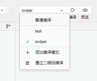
project.private.config.json 文件中配置,参考 官方文档Code sample:
"condition": { //模式配置,仅开发期间生效
	"list": [{
			"name": "swiper", //模式名称
			"path": "pages/component/swiper/swiper", //启动页面,必选
		},
		{
			"name": "test",
			"path": "pages/component/switch/switch"
		}
	]
}
Subpackage loading configuration, this configuration is the subpackage loading mechanism of the MiniApp.
Because MiniApp have size and resource loading limitations, each MiniApp platform provides a subpackage method to optimize the download and startup speed of MiniApp.
The so-called main package is to place the default startup page/TabBar page, and all subpackages need to use public resources/JS scripts; and the subpackages are divided according to the configuration of pages.json.
When the MiniApp is started, the main package will be downloaded by default and the pages in the main package will be launched. When the user enters a page in the subpackage, the corresponding subpackage will be downloaded automatically, and then displayed after the download is complete. At this time, there will be a waiting prompt on the terminal interface.
App默认为整包。从uni-app 2.7.12+ 开始,vue2模式也兼容了小程序的分包配置。其目的不用于下载提速,而用于首页是vue时的启动提速。App下开启分包,除在pages.json中配置分包规则外,还需要在manifest中设置在app端开启分包设置,详见:https://uniapp.dcloud.io/collocation/manifest?id=app-vue-optimization
The subPackages node receives an array, each item in the array is a sub-package of the application, and its attribute values are as follows:
| Attribute | Type | Required | Description |
|---|---|---|---|
| root | String | Yes | the root directory of the subpackage |
| pages | Array | Yes | What pages are the subpackages composed of? The parameters are the same as pages |
Notice:
subPackages is a relative path under root, not a full path.static 目录,用来对静态资源进行分包。uni-app内支持对微信小程序、QQ小程序、百度小程序、支付宝小程序、抖音小程序(HBuilderX 3.0.3+)、快手小程序分包优化,即将静态资源或者js文件放入分包内不占用主包大小。详情请参考:关于分包优化的说明vendor.js is too large, you can use runtime compression code
HBuilderX, check Run-->Run to MiniApp Simulator-->Whether to compress the code at runtimecli can add the parameter --minimize in package.json, example: "dev:mp-weixin": "cross-env NODE_ENV=development UNI_PLATFORM=mp-weixin vue-cli- service uni-build --watch --minimize"Instructions:
假设支持分包的 uni-app 目录结构如下:
┌─pages
│  ├─index
│  │  └─index.vue
│  └─login
│     └─login.vue
├─pagesA
│  ├─static
│  └─list
│     └─list.vue
├─pagesB
│  ├─static
│  └─detail
│     └─detail.vue
├─static
├─main.js
├─App.vue
├─manifest.json
└─pages.json
You need to fill in pages.json
{
	"pages": [{
		"path": "pages/index/index",
		"style": { ...}
	}, {
		"path": "pages/login/login",
		"style": { ...}
	}],
	"subPackages": [{
		"root": "pagesA",
		"pages": [{
			"path": "list/list",
			"style": { ...}
		}]
	}, {
		"root": "pagesB",
		"pages": [{
			"path": "detail/detail",
			"style": { ...}
		}]
	}],
	"preloadRule": {
		"pagesA/list/list": {
			"network": "all",
			"packages": ["__APP__"]
		},
		"pagesB/detail/detail": {
			"network": "all",
			"packages": ["pagesA"]
		}
	}
}
Subpackage preload configuration.
After the preloadRule is configured, when entering a certain page of the MiniApp, the framework will automatically pre-download the subpackages that may be required to improve the startup speed when entering subsequent subpackage pages
In preloadRule, key is the page path, and value is the pre-download configuration for entering this page. Each configuration has the following items:
| Field | Type | Required | Default | Description |
|---|---|---|---|---|
| packages | StringArray | Yes | None | The root or name of the pre-download subpackage after entering the page. __APP__ represents the main package. |
| network | String | No | wifi | Pre-download under the specified network, optional values are: all (unlimited network), wifi (only pre-download under wifi) |
App subcontracting also supports preloadRule, but network rules are invalid.