English
datacom, with the full name of data components, is a data-driven component.
This component is also a vue component, a subclass, and an encapsulation of basic components.
Compared with ordinary vue components, the feature of the datacom component is that if a data containing a group of candidate data is bound, the result can be automatically rendered.
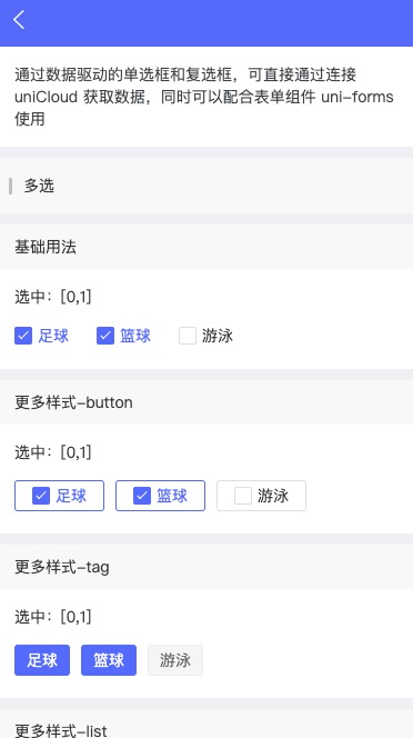
For example, if the uni-data-checkbox component is bound to a data, a set of select boxes can be directly generated.
<template>
    <!-- Pass in data that meets the datacom specification to render a set of checkboxes -->
    <!-- Use v-model to bind the selected value of checkbox in two ways-->
    <uni-data-checkbox v-model="value" :localdata="options" multiple></uni-data-checkbox>
</template>
<script>
  export default {
    data() {
      return {
        value: ['sh'],
        options: [
          {value: 'bj',text: '北京'},
          {value: 'sh',text: '上海'},
        ],
      };
    },
  };
</script>
For the writing mode with basic components, the code lines will increase a lot, as follows:
<template>
    <view>
        <view class="uni-list">
            <checkbox-group @change="checkboxChange">
                <label class="uni-list-cell" v-for="item in items" :key="item.value">
                    <view>
                        <checkbox :value="item.value" :checked="item.checked" />
                    </view>
                    <view>{{item.name}}</view>
                </label>
            </checkbox-group>
        </view>
    </view>
</template>
<script>
    export default {
        data() {
            return {
                items: [{
                        value: 'bj',
                    },
                    {
                        value: 'sh',
                        checked: 'true'
                    },
                    {
                        value: 'gz',
                    }
                ]
            }
        },
        methods: {
            checkboxChange: function (e) {
                var items = this.items,
                    values = e.detail.value;
                for (var i = 0, lenI = items.length; i < lenI; ++i) {
                    const item = items[i]
                    if(values.includes(item.value)){
                        this.$set(item,'checked',true)
                    }else{
                        this.$set(item,'checked',false)
                    }
                }
            }
        }
    }
</script>

<style>
.uni-list-cell {
    justify-content: flex-start
}
</style>
Obviously, there is more than one <uni-data-checkbox> for datacom component , radio, check, select, picker, segement, tree ... and many other components can become datacom components and become similar <uni-data-picker>.
In this way, the "datacom component specification" defines what is datacom component and their interconnection standards.
All developers can submit components that meet datacom component specification in the DCloud plug-in market. All uploaded datacom components can be found under the component category of plug-in market. See details
See the "datacom component specification" below for details.
datacom components define the data specification of server, and the data input and output specifications of front-end components. It enhances the degree of standardization of the industry, refines the division of work and improves the efficiency.
Regardless of the industry influence, there are many obvious benefits to developers:
datacom组件,服务器代码直接就不用写了For example, suppose we want to realize the transaction of city selection.
<xx-data-citypicker> on the front endunicloud-db component to pull down the city table data of the database and bind it to <xx-data-citypicker>datacom component specification. There may be full-screen options, half-screen options at the bottom, search boxes at the top, index letters at the right ... No matter what kind of city selection components, you can change them at will, because they all conform to a data specification.<uni-forms> componentThe data structure accepted by datacom component includes two data structure specifications: "array" and "tree".
data is a recyclable data set. Each piece of data in the array has the following basic key:
| key | Describe |
|---|---|
| value | Value. Required |
| text | Display text. Required |
| selected | Whether it is selected by default. The default value is false |
| disable | Disable or not. The default value is false |
| group | Grouping mark |
If you are familiar with the <select> tag of html, the attributes of the <option> tag are also value, text, and selected.
In addition to these basic key, developers are also free to extend key. For example, the seat selection of movie tickets, air tickets and train tickets all require additional information: rows, columns, cell types (seats or aisles), etc.
For the complete JSON Schema definition, please refer to https://gitee.com/dcloud/datacom/blob/master/array.schema.json
[
{"value": "bj","text": "北京"},
]
Component example: uni-data-checkbox
Usage example:
	<template>
		<!-- Pass in data that meets the datacom specification to render a set of checkboxes -->
		<!-- Use v-model to bind the selected value of checkbox in two ways-->
		<uni-data-checkbox v-model="value" :localdata="options" multiple></uni-data-checkbox>
	</template>
	<script>
	  export default {
		data() {
		  return {
			value: ['bj'],
			options: [
			  { value: "bj", text: "北京" },
			],
		  };
		},
	  };
	</script>
data is a traversable nested data set. Each piece of data in the array has the following basic key:
| key | Describe |
|---|---|
| value | Value. Required |
| text | Display text. Required |
| selected | Whether it is selected by default. The default value is false |
| disable | Disable or not. The default value is false |
| isleaf | Whether it is a leaf node. The default value is false, and true indicates ignoring the children |
| children | Child node. Its value has the same format as the parent node |
For the complete JSON Schema definition, please refer to https://gitee.com/dcloud/datacom/blob/master/tree.schema.json
[{
"value": "110000",
"children": [{
	"value": "110105",
}, {
	"value": "110108",
}]
}]
Component example: uni-data-picker
Usage example:
	<template>
	  <!-- Pass in data that meets the datacom specification to render a selector -->
	  <!-- Use v-model to bind the selected value of picker in two ways-->
	  <uni-data-picker v-model="value" :localdata="items"></uni-data-picker>
	</template>
	<script>
	  export default {
		data() {
		  return {
			value: ["110000","110105"],
			items: [{
				"value": "110000",
				"children": [{
					"value": "110105",
				}, {
					"value": "110108",
				}]
			}],
		  };
		},
	  };
	</script>
The data of datacom component can come from the page local, i.e., localdata, or can directly specify the cloud database query result of uniCloud, i.e., specify the collection table name, field name, and where condition. These writing methods are the same as those of unicloud-db component. If both localdata and collection exist, localdata is preferred.
Examples of localdata have been given above. Let's move on to the writing mode of directly specifying the uniCloud cloud database query.
	<template>
		<!-- Pass in data that meets the datacom specification to render a set of checkboxes -->
		<!-- Use v-model to bind the selected value of checkbox in two ways-->
		<uni-data-checkbox v-model="value" collection="" where="" field="" multiple></uni-data-checkbox>
	</template>
	<script>
	  export default {
		data() {
		  return {

		  };
		},
	  };
	</script>
collection表名、field字段名、where条件的写法,详见clientDB组件文档
Of course, it supports the binding of uniCloud data, and it is optional for datacom component specification.
A more common scenario is to install a clientDB component around the whole page component, conduct database query once, and split the data of the query result into different datacom components.
The datacom component specification also requires that the binding value is supported, and two-way binding is supported, that is, the v-model instruction is supported. This is also for the form verification of uni-forms.
When the data of datacom component comes from uniCloud's cloud database or cdn and other clouds, and the amount of data is large, we can usually choose step-by-step query to optimize the user experience, such as the following scenarios:
datacom component designs the following component attributes and events for step-by-step query of cloud data:
| Attribute name | Type | Defaults | Instruction |
|---|---|---|---|
| step-search | Boolean | true | Whether to query cloud data step-by-step. Commonly used in trees, pickers, paging lists, etc., refer to uni-data-picker |
| step-search-url | String | Request address of cloud data query step-by-step. Commonly used in trees, pickers, paging lists, etc., refer to uni-data-picker | |
| self-field | String | The current field name of the "tree" structure. Commonly used in trees, picker, refer to uni-data-picker | |
| parent-field | String | The parent field name of the "tree" structure. Commonly used in trees, picker, refer to uni-data-picker | |
| @stepsearch | EventHandle | Triggered when querying data step-by-step. Can be used to customize step-by-step query data, refer to: uni-data-picker |
datacom component designs the following component attributes and events for pop-up components:
| Attribute name | Type | Defaults | Instruction |
|---|---|---|---|
| preload | Boolean | false | Whether to preload cloud data. Refer to: uni-data-picker |
| @popupopened | EventHandle | Triggered when the component pop-up displays. Refer to: uni-data-picker | |
| @popupclosed | EventHandle | Triggered when the component pop-up closes. Refer to: uni-data-picker |
There are many selection components, and the basic logic is to select one or more of them within the specified data range.
According to different dimensions, it can be divided into:
Here's a list of common selection components and their classification according to different dimensions, which will be helpful to better understand their essence
| Component | Selection mode | Data structure | Illustration mode | Scenes of use | Instruction |
|---|---|---|---|---|---|
| radio (radio box) | Single choice | Array | Tile | Form | List radio, button group radio and label group radio |
| checkbox (check box) | Multiple choice | Array | Tile | Form | List checkbox, button group checkbox and label group checkbox |
| select (drop down list) | Single selection, multiple selection | Array | Pop up | Form | Radio drop-down list and checkbox drop-down list |
| picker (scrolling picker) | Single choice | Array, Tree | Pop up | Form | Single column picker (array), multi-column picker (tree) |
| cascader (cascade selection) | Single selection, multiple selection | Tree | Pop up | Form | |
| transfer (shuttle box) | Multiple choice | Array | Tile | Form | |
| slider (slider) | Single choice | Number range | Tile | Form | |
| rate | Single choice | Number range | Tile | Form | |
| stepper (stepper) | Single choice | Number range | Tile | Form | |
| Header filter | Multiple choice | Array | Pop up | Form | |
| City selection | Single choice | Tree | Pop-up, tile | Form | |
| segement (segmenter) | Single choice | Array | Tile | Exhibit | |
| Side navigation | Single choice | Array | Tile | Exhibit | |
| tree (tree control) | Single selection, multiple selection | Tree | Tile | Exhibit |
欢迎开发者们开发这些datacom组件。插件市场提供了datacom组件专区,给予更高的显示权重。
版本要求:HBuilderX 3.1.0+
It is relatively easy to develop a datacom component that supports localdata, but there will be a lot of work to develop a datacom component that supports cloud data and realize the analysis of collection, field, where and other attributes.
For this reason, the official provides a mixin library. Developers can mix uniCloud.mixinDatacom into their datacom components to easily enable their components to support local and cloud data binding, and quickly complete datacom components.
mixin is the technology of vue. If you are not familiar with it, please refer to mixin document on vue official website
props of uniCloud.mixinDatacom
It is the same as the standard datacom component, except for localdata, the others are all standard attributes of uniCloud-db component.
| Attribute name | Type | Defaults | Instruction |
|---|---|---|---|
| localdata | Array | 本地数据,详情 | |
| spaceInfo | Object | 服务空间信息,新增于HBuilderX 3.2.11。同uniCloud.init参数,参考:uniCloud.init | |
| collection | String | Table Name. Support input of multiple table names, separated by , | |
| field | String | 查询字段,多个字段用 , 分割 | |
| where | String | 查询条件,内容较多,另见jql文档:详情 | |
| orderby | String | Sorting field and forward and reverse sequence settings | |
| groupby | String | Group data | |
| group-field | String | Group data for statistics | |
| distinct | Boolean | false | 是否对数据查询结果中重复的记录进行去重 |
| action | string | 云端执行数据库查询的前或后,触发某个action函数操作,进行预处理或后处理,详情。场景:前端无权操作的数据,比如阅读数+1 | |
| page-data | String | add | Paging strategy selection. The value of add means that the data of the next page is appended to the previous data, which is often used to scroll to the bottom to load the next page; When the value is replace, it replaces the current data, which is often used for PC-style interaction. There is a paging button at the bottom of the list. |
| page-current | Number | 0 | Current page |
| page-size | Number | 20 | Number of data per page |
| getcount | Boolean | false | Whether to query the total number of data items, the default is false, and when paging mode is required, specify it as true |
| getone | Boolean | false | Specifies whether the query result returns only the first data of the array, which is false by default. In case of false, return the array, even if there is only one result, it needs to be obtained with the method of [0]. When the value is true, returned the result data directly and lost one layer of array. Generally used for non-list pages, such as details pages |
| gettree | Boolean | false | Whether to query tree data, the default is false |
| startwith | String | '' | The first level condition of gettree can be omitted. If startWith is not sent, the query starts from the top level by default |
| limitlevel | Number | 10 | gettree查询返回的树的最大层级。超过设定层级的节点不会返回。默认10级,最大15,最小1 |
| foreign-key | String | '' | 手动指定使用的关联关系,HBuilderX 3.1.10+ 详情 |
data of uniCloud.mixinDatacom
| Attribute name | Type | Defaults | Instruction |
|---|---|---|---|
| mixinDatacomLoading | Boolean | false | Load data status |
| mixinDatacomHasMore | Boolean | false | Is there more data? |
| mixinDatacomResData | Array | [] | Query the returned data |
| mixinDatacomErrorMessage | String | Wrong information | |
| mixinDatacomPage | OBject | Paging information |
uniCloud.mixinDatacom methods
| Method name | Instruction |
|---|---|
| mixinDatacomGet | Load Data |
| mixinDatacomEasyGet | Load data, including mixinDatacomLoading, mixinDatacomHasMore, mixinDatacomErrorMessage logic |
| onMixinDatacomPropsChange | Triggered when the attribute changes |
The following steps are required to develop the datacom component using uniCloud.mixinDatacom
mixin: [uniCloud.mixinDatacom] under export defaultdata state of uniCloud.mixinDatacom and load mixinDatacomLoading, load error prompt mixinDatacomErrorMessage, process data and related UI display mixinDatacomResDatamixinDatacomGet() or mixinDatacomEasyGet() in uniCloud.mixinDatacom during the component's created life cycle, a cloud database can be requested. The differences between the two methods are as follows:
mixinDatacomGet() only requests data and handles various statuses and exceptions by itself.mixinDatacomEasyGet() encapsulates the loading status, paging and error messages on the basis of mixinDatacomGet(), which can be bound by template. User-friendlyAdvantages of using uniCloud.mixinDatacom to develop datacom components
datacom componentuniClinetDB APIonMixinDatacomPropsChange(needReset, changed) {} parameter needReset is trueuniClinetDB, the component code does not need to be updatedFor example, develop a datacom component named as uni-data-jql:
mixinDatacomEasyGet()<!-- uni-data-jql.vue -->
<template>
<view>
<view v-if="mixinDatacomLoading">Loading...</view>
<view v-else-if="mixinDatacomErrorMessage">
请求错误:{{mixinDatacomErrorMessage}}
</view>
<view v-else="mixinDatacomResData">
<!-- Need to process data and related UI display by yourself -->
{{mixinDatacomResData}}
</view>
</view>
</template>
<script>
export default {
mixins: [uniCloud.mixinDatacom],
data() {
return {}
},
created() {
//Call the method in uniCloud.mixinDatacom to load the data
this.mixinDatacomEasyGet()
},
methods: {
//When the component attribute changed
onMixinDatacomPropsChange(needReset, changed) {
//needReset=true needs to reset the loaded data and paging information, such as collection, orderby
//changed, attribute name of change with the type of Array, such as ['collection', 'orderby']
if (needReset) {
//Remove the loaded data
this.mixinDatacomResData = []
//Reset the paging data. If no paging, skip this
this.mixinDatacomPage.size = this.pageSize // 重置分页大小
this.mixinDatacomPage.current = 0 // 重置当前分页
}
}
}
}
</script>
mixinDatacomGet()Need to write more codes to handle various states. If the encapsulation of mixinDatacomEasyGet cannot meet your needs flexibly, you can use this method.
<!-- uni-data-jql.vue -->
<template>
	<view>
		<view v-if="mixinDatacomLoading">Loading...</view>
		<view v-else-if="mixinDatacomErrorMessage">
			请求错误:{{mixinDatacomErrorMessage}}
		</view>
		<view v-else="mixinDatacomResData">
			<!-- Need to process data and related UI display by yourself -->
			{{mixinDatacomResData}}
		</view>
	</view>
</template>

<script>
	export default {
		mixins: [uniCloud.mixinDatacom],
		data() {
			return {}
		},
		created() {
			this.load()
		},
		methods: {
			load() {
				if (this.mixinDatacomLoading == true) {
					return
				}
				this.mixinDatacomLoading = true

				this.mixinDatacomGet().then((res) => {
					this.mixinDatacomLoading = false
					const {
						data,
						count
					} = res.result
					this.mixinDatacomResData = data
				}).catch((err) => {
					this.mixinDatacomLoading = false
					this.mixinDatacomErrorMessage = err
				})
			},
			//When the component attribute changed
			onMixinDatacomPropsChange(needReset, changed) {
				//needReset=true needs to reset the loaded data and paging information, such as collection, orderby
				//changed, attribute name of change with the type of Array, such as ['collection', 'orderby']
				if (needReset) {
					//Remove the loaded data
					this.mixinDatacomResData = []

					//Reset the paging data. If no paging, skip this
					this.mixinDatacomPage.size = this.pageSize // 重置分页大小
					this.mixinDatacomPage.current = 0 // 重置当前分页
				}
			}
		}
	}
</script>
After completing the uni-data-jql component, it can be used in the page:
<template>
	<view>
		<uni-data-jql collection="table1"></uni-data-jql>
	</view>
</template>

<script>
	//jql.vue component
	export default {
		components: {
		},
		data() {
			return {}
		},
		methods: {}
	}
</script>
uniCloud.mixinDatacom 源码 In order to help the developers to understand the working principle of mixinDatacom easily, the source code of mixinDatacom is posted here:
uni-app-x 3.99+ 开始支持
js
uts
export default {
	props: {
		localdata: {
			type: Array,
			default () {
				return []
			}
		},
		options: {
			type: [Object, Array],
			default () {
				return {}
			}
		},
		collection: {
			type: String,
			default: ''
		},
		action: {
			type: String,
			default: ''
		},
		field: {
			type: String,
			default: ''
		},
		orderby: {
			type: String,
			default: ''
		},
		where: {
			type: [String, Object],
			default: ''
		},
		pageData: {
			type: String,
			default: 'add'
		},
		pageCurrent: {
			type: Number,
			default: 1
		},
		pageSize: {
			type: Number,
			default: 20
		},
		getcount: {
			type: [Boolean, String],
			default: false
		},
		gettree: {
			type: [Boolean, String],
			default: false
		},
		gettreepath: {
		  type: [Boolean, String],
		  default: false
		},
		startwith: {
		  type: String,
		  default: ''
		},
		limitlevel: {
		  type: Number,
		  default: 10
		},
		groupby: {
		  type: String,
		  default: ''
		},
		groupField: {
		  type: String,
		  default: ''
		},
		distinct: {
		  type: [Boolean, String],
		  default: false
		},
		manual: {
		  type: Boolean,
		  default: false
		}
	},
	data() {
		return {
			mixinDatacomLoading: false, // 网络请求状态
			mixinDatacomHasMore: false, // 是否有更多数据
			mixinDatacomResData: [], // 请求返回的数据,调用 loadData 后会更新
			mixinDatacomErrorMessage: '', // 请求出错时的错误消息
		}
	},
	created() {
		this.mixinDatacomPage = {
			current: this.pageCurrent, // 当前页面,初始化设置 props中的 pageCurrent
			size: this.pageSize, // 页面大小,初始化设置 props中的 pageSize
		}
		this.$watch(() => {
			var al = [];
			['pageCurrent',
				'pageSize',
				'localdata',
				'collection',
				'action',
				'field',
				'orderby',
				'where',
				'getont',
				'getcount',
				'gettree'
			].forEach(key => {
				al.push(this[key])
			})
			return al
		}, (newValue, oldValue) => {
			let needReset = false
			let changed = []
			for (let i = 2; i < newValue.length; i++) {
				if (newValue[i] !== oldValue[i]) {
					needReset = true
					changed.push(newValue[i])
				}
			}
			if (newValue[0] !== oldValue[0]) {
				this.mixinDatacomPage.current = this.pageCurrent
			}
			this.mixinDatacomPage.size = this.pageSize

			this.onMixinDatacomPropsChange(needReset, changed)
		})
	},
	methods: {
		//It is called when props is changed, and this method will be overridden in the component
		//For non pageCurrent, when pageSize changes, needReset=true, and data needs to be reset
		//changed, attribute name of change occured with the type of Array, such as ['collection', 'action']
		onMixinDatacomPropsChange(needReset, changed) {},
		//Load Data
		mixinDatacomEasyGet({
			getone = false,
			success,
			fail
		} = {}) {
			if (this.mixinDatacomLoading) {
				return
			}
			this.mixinDatacomLoading = true

			this.mixinDatacomErrorMessage = ''

			this.mixinDatacomGet().then((res) => {
				this.mixinDatacomLoading = false
				const {
					data,
					count
				} = res.result
				if (this.getcount) {
					this.mixinDatacomPage.count = count
				}
				this.mixinDatacomHasMore = data.length < this.pageSize
				const responseData = getone ? (data.length ? data[0] : undefined) : data
				this.mixinDatacomResData = responseData

				if (success) {
					success(responseData)
				}
			}).catch((err) => {
				this.mixinDatacomLoading = false
				this.mixinDatacomErrorMessage = err
				fail && fail(err)
			})
		},
		//Call uniClientDB to query data
		mixinDatacomGet(options = {}) {
			let db = uniCloud.database()

			const action = options.action || this.action
			if (action) {
				db = db.action(action)
			}

			const collection = options.collection || this.collection
			db = db.collection(collection)

			const where = options.where || this.where
			if (!(!where || !Object.keys(where).length)) {
				db = db.where(where)
			}

			const field = options.field || this.field
			if (field) {
				db = db.field(field)
			}

			const groupby = options.groupby || this.groupby
			if (groupby) {
				db = db.groupBy(groupby)
			}

			const groupField = options.groupField || this.groupField
			if (groupField) {
				db = db.groupField(groupField)
			}

			const distinct = options.distinct !== undefined ? options.distinct : this.distinct
			if (distinct === true) {
				db = db.distinct()
			}

			const orderby = options.orderby || this.orderby
			if (orderby) {
				db = db.orderBy(orderby)
			}

			const current = options.pageCurrent !== undefined ? options.pageCurrent : this.mixinDatacomPage.current
			const size = options.pageSize !== undefined ? options.pageSize : this.mixinDatacomPage.size
			const getCount = options.getcount !== undefined ? options.getcount : this.getcount
			const gettree = options.gettree !== undefined ? options.gettree : this.gettree
			const gettreepath = options.gettreepath !== undefined ? options.gettreepath : this.gettreepath
			const limitLevel = options.limitlevel !== undefined ? options.limitlevel : this.limitlevel
			const startWith = options.startwith !== undefined ? options.startwith : this.startwith

			const getOptions = {
				getCount
			}
			const treeOptions = {
				limitLevel,
				startWith
			}
			if (gettree) {
				getOptions.getTree = treeOptions
			}
			if (gettreepath) {
				getOptions.getTreePath = treeOptions
			}

			db = db.skip(size * (current - 1)).limit(size).get(getOptions)

			return db
		}
	}
}