
English
HarmonyOS Next 不支持
app side nvue specific component.
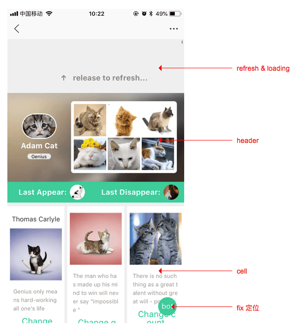
The <waterfall> component is the core component that provides the waterfall layout. Waterfall flow, also known as waterfall flow layout, is a relatively popular page layout, and the visual performance is a jagged multi-column layout. This layout also continuously loads chunks of data and appends to the current tail as the page scroll bar scrolls down.
In nvue, using ordinary view as waterfall flow cannot achieve reuse and release of invisible rendering resources. After using the <waterfall> component and specifying cell, the native engine will automatically optimize the performance.
<template>
  <waterfall column-count="2" column-width="auto">
    <cell v-for="num in lists" >
      <text>{{num}}</text>
    </cell>
  </waterfall>
</template>
<script>
  export default {
    data () {
      return {
        lists: ['A', 'B', 'C', 'D', 'E']
      }
    }
  }
</script>

<style></style>
Similar to the <list> component, the sub-components of the <waterfall> component can only include the following four components or fixed components, and other forms of components will not be rendered correctly.
<cell>: Used to define the sub-list items in the list, similar to the ul to li in HTML.<waterfall> Efficient memory reclamation will be performed on <cell> to achieve better performance.<header>: When <header> reaches the top of the screen, it snaps to the top of the screen.<refresh>: Used to add a pull-down refresh function to the list.<loading>:<loading> 用法与特性和 <refresh> 类似,用于给列表添加上拉加载更多的功能。

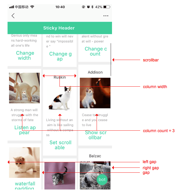
[Optional] are true/false, and the default value is true. Control whether scroll bars appear.[Optional] describes the number of columns in the waterfall flow
<integer>: Optimal number of columns. If both column-width and column-count are specified as non-zero values, then column-count represents the maximum number of columns.[Optional] describes the column width of each column of the waterfall flow
auto: means that the column width is determined by other attributes (such as column-count)<length>: optimal column width, the actual column width may be wider (need to fill the remaining space), or narrower (if the remaining space is smaller than the column width). The value must be greater than 0[optional] the column-to-column gap. Corresponds to 32 if normal is specified.[optional] the gap between the left cell and the list. If not specified, it corresponds to 0[可选]右边cell和列表的间隙. 如果未指定,则对应 0 
[Optional] The optional value is true/false, the default value is false, iOS platform, when the content is less than one screen and cannot trigger the pull-down refresh, it needs to be set to true, because the default subview height does not exceed The waterfall cannot slide when the parent view is highFor other supported attributes, see <list> component attribute section
All Universal Events are supported:
Notice
<template>
  <waterfall column-count="2" column-width="auto" :style="{ height: windowHeight + 'px' }">
    <header>
      <!--轮播-->
      <swiper class="swiper_banner">
        ......
      </swiper>
      <!--广告位-->
      <view class="ads_List_box">
        ......
      </view>
    </header>
    <!--瀑布流展示的商品列表-->
    <cell v-for="num in lists" >
      <text>{{num}}</text>
    </cell>
  </waterfall>
</template>
<script>
  export default {
    data () {
      return {
        lists: ['A', 'B', 'C', 'D', 'E'],
        windowHeight: uni.getSystemInfoSync().windowHeight
      }
    }
  }
</script>

<style></style>
