English
HarmonyOS Next 不支持
app side nvue specific component. Under app-nvue, if it is a long list, the perlistance of using the list component is higher than that of scrolling using view or scroll-view. The reason lies in that list has special optimization for rendering resource recycling of the invisible part.
The resource recycling mechanism of native rendering is different from webview rendering. webview does not require data to have a regular format. The rendering resources will be automatically recycled when the long page is in the invisible part, unless webview uses area scrolling instead of page scrolling. Therefore, this problem needs no attention as long as the vue page doesn't use scroll-view. Native rendering, on the other hand, must be noted.
If cross-end is needed, it is recommended to use the uni-list of uni-ui component, which will automatically handle the webview rendering and native rendering. Use the list component under app-nvue, while page scrolling on other platforms. See https://ext.dcloud.net.cn/plugin?id=24 for details
The <list> component is the core component that provides the vertical list function, with smooth scrolling and efficient memory management, which is very suitable for displaying long lists. The easiest way to use it is to fill in the <list> tag with a set of <cell> tags generated by a simple array loop.
<template>
  <list>
    <!-- Precautions: index cannot be the unique identifier of key -->
    <cell v-for="(item, index) in dataList" :key="item.id">
      <text>{{item.name}}</text>
    </cell>
  </list>
</template>

<script>
  export default {
    data () {
      return {
        dataList: [{id: "1", name: 'A'}, {id: "2", name: 'B'}, {id: "3", name: 'C'}]
      }
    }
  }
</script>
Notice
- When
<list>or<scroll-view>in the same direction are nested with each other, the child<list>is not scrollable on the Android platform but possible on iOS. iOS has Bounce effect, while Android only has this effect when scrolling<list>needs to explicitly set its width and height with position: absolute; position or width and height to set its width and height value.- The list is an area scrolling, which will not trigger page scrolling, and cannot trigger the pull-down refresh configured in pages.json, the page bottom onReachBottomDistance, the transparent gradient of titleNView, and the transparentTitle navigation bar of style.
- On the Android platform, due to the
<list>efficient memory recycling mechanism, components that are not in the visible area of the screen will not be created, resulting in some internal components that need to calculate the width and height to fail to work, such as<slider>,<progress>,<swiper>
The sub-components of <list> can only include the following four components or fixed components, and other types of components will not be rendered correctly.
<cell><list> Efficient memory reclamation will be performed on <cell> to achieve better performance.<header><header> reaches the top of the screen, it snaps to the top of the screen.<loading><loading> are similar to those of <refresh>, which are used to add pull-ups and load more functions to the list.| Attribute name | Instruction | Type | Defaults |
|---|---|---|---|
| show-scrollbar | Control whether scroll bars appear | boolean | true |
| bounce | Control the bounce effect, and iOS does not support dynamic modification | boolean | true |
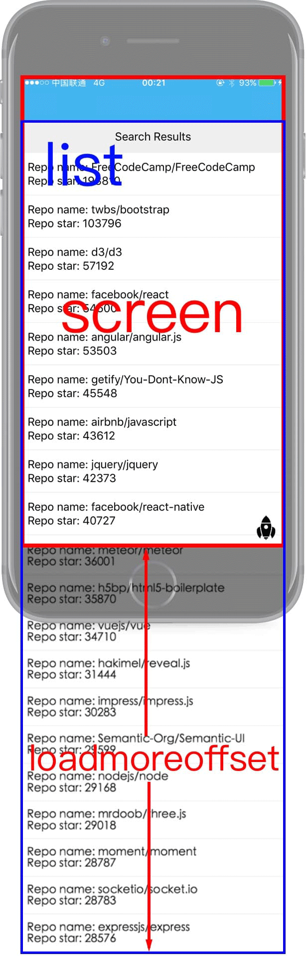
| loadmoreoffset | The vertical offset distance required to trigger the loadmore event (the distance between the bottom of the device screen and the bottom of the list). It is recommended to set this value manually, and a value greater than 0 will do | number | 0 |
| offset-accuracy | Control the frequency of onscroll event being triggered: indicates that the list has scrolled at least 10px between two onscroll events. Note that setting this value to a smaller value will improve the accuracy of scrolling event sampling, but will also reduce the performance of the page | number | 10 |
| pagingEnabled | Whether to display the List in paging mode, with false as the default value | boolean | true/false |
| scrollable | Whether to allow List scrolling | boolean | true/false |
| enable-back-to-top | iOS clicks the top status bar scroll bar to return to the top, only supports vertical | boolean | false |
| render-reverse | defines whether to render from the bottom, it needs to be used together with the cell attribute render-reverse-position, separate configuration will cause rendering exception. HBuilderX3.6.9+ support | boolean | false |
Schematic diagram of loadmoreoffset:
Set the nested list parent container to support the scrolling effect of swiper-list heading
| Attribute | Description | Type | Required | Remarks |
|---|---|---|---|---|
| id | list parent container scrolling component id | String | Yes | Should be the outermost scrolling container and must be a list component |
| headerHeight | Ceiling distance | Number | Yes | The distance between the top of the sub-list and the top of the outermost scrolling container |
scrollToElement(ref, options)
Scroll to the specified position, details scrollToElement
loadmore event
will be triggered immediately if the list scrolls to the bottom. You can load the list items of the next page in the handler of this event. If not triggered, please check whether the value of loadmoreoffset is set. It is recommended to set this value greater than 0
How to reset loadmore
<template>
  <list ref="list" loadmoreoffset="100" @loadmore="loadmore">
    <cell v-for="num in lists">
      <text>{{num}}</text>
    </cell>
  </list>
</template>

<script>
  export default {
    data () {
      return {
        lists: ['A', 'B', 'C', 'D', 'E','F','G','H','I','J']
      }
    },
    methods: {
        // Reset loadmore
        resetLoadMore() {
            this.$refs["list"].resetLoadmore();
        },
        loadmore(){
          this.lists.push('1');
        }

    }
  }
</script>
scroll event
will be triggered when the list scrolls, and the default sampling rate of the event is 10px, i.e., the list will be triggered once every 10px of scrolling, and the sampling rate can be set by the attribute offset-accuracy.
event object attributes in the event:
contentSize {Object}: List content size
width {number}: List content widthheight {number}: List content heightcontentOffset {Object}: List offset size
x {number}: Offset on the x-axisy {number}: Offset on the y-axisisDragging {boolean}: Is the user dragging the list?Set nested parent container information
args is the parameter to be set, being json type. It can contain the following elements
| property | type | default value | required | description |
|---|---|---|---|---|
| id | string | none | yes | The id of the component that scrolls with the list at the same time, should be the outer scroller |
| headerHeight | float | 0 | Yes | The distance from the top of the header to the top of the scroller to the top of the scroller, Android does not currently support |
<template>
    <!-- ios needs to configure fixFreezing="true" -->
    <view class="uni-swiper-page">
        <list ref="list" fixFreezing="true">
        </list>
    </view>
</template>

<script>
  export default {
    data () {
      return {
      }
    },
    methods: {
      // reset loadmore
      setSpecialEffects() {
        this.$refs["list"].setSpecialEffects({id:"scroller", headerHeight:150});
      },
      clearSpecialEffects() {
        this.$refs["list"].setSpecialEffects({});
      }
    }
  }
</script>
setSpecialEffects Complete code: https://github.com/dcloudio/hello-uniapp/tree/master/pages/template/swiper-list-nvue