English
For those native functions that do not depend on UI interaction, nvue encapsulates them into modules, which is a method of calling native capabilities through javascript.
uni.requireNativePlugin// Usage mode
const PluginName = uni.requireNativePlugin(PluginName); // PluginName 为原生插件名称
Third-party native plug-ins that support native cloud packaging in the project nativeplugins directory and plug-in market. It is also very convenient for you to transplant the existing native modules to nvue platform. How to use: in manifest.json->App native plug-in configuration->select local plug-in or cloud plug-in->make a custom base to use. See details
nvue also supports js API interface of uni-app. Unless otherwise specified, it means that both vue file and nvue file support it. See details.
uni-app API not supported in nvue, [see details](#nvue-%E9%87%8C%E4%B8%8D%E6%94%AF%E6%8C%81%E7%9A%84- uni-app-api)
Weex provides DOM.addRule to load custom fonts. Developers can load iconfont and custom font by specifying font-family. Developers can use the following code to load custom fonts:
<template>
<view>
<text class="my-iconfont"></text>
</view>
</template>
<script>
export default{
beforeCreate() {
const domModule = uni.requireNativePlugin('dom')
domModule.addRule('fontFace', {
'fontFamily': "myIconfont",
'src': "url('http://at.alicdn.com/t/font_2234252_v3hj1klw6k9.ttf')"
});
}
}
</script>
<style>
.my-iconfont {
font-family:myIconfont;
font-size:60rpx;
color: #00AAFF;
}
</style>

addRule(type, contentObject)
font-family.url('http://at.alicdn.com/t/font_1469606063_76593.ttf')url('https://at.alicdn.com/t/font_1469606063_76593.ttf')url('file://storage/emulated/0/Android/data/com.alibaba.weex/cache/http:__at.alicdn.com_t_font_1469606063_76593.ttf')url('data:font/truetype;charset=utf-8;base64,AAEAAAALAIAAAwAwR1NVQrD+....'), the above data fields are incomplete.Notice
You can name
fontFamilyinaddRuleas you wish in your page, any string is OK. But this is not the real font-family name of the font file. The real name or system name for the font is stored in binrary data of ttf file. You must ensure that the real font-family name of font file is unique. Or your font may not be successfully registered to device and your text may display as a '?'. Specially, if you are using http://www.iconfont.cn/ to build your iconfont. Make sure that you set a unique enough font-family name for your font in project settings. CallingaddRuleinbeforeCreateis recommended.
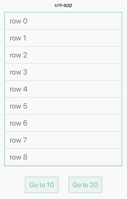
Let the page scroll to the component corresponding to ref. This API can only be used for the child nodes of scrollable components, such as <scroller>, <list>, <waterfall> and other scrollable components.
scrollToElement(ref, options)
offset, an space on top of the ref component, which is also scrolling down to the visual viewport. Default is 0.animated, a boolean indicates whether a scroll animation should be played. If set to false, the ref component will jump into the view without any transition animation. Default is true. <template>
<view class="wrapper">
<scroller class="scroller">
<view class="row" v-for="(name, index) in rows" :ref="'item'+index">
<text class="text" :ref="'text'+index">{{name}}</text>
</view>
</scroller>
<view class="group">
<text @click="goto10" class="button">Go to 10</text>
<text @click="goto20" class="button">Go to 20</text>
</view>
</view>
</template>
<script>
const dom = uni.requireNativePlugin('dom')
export default {
data() {
return {
rows: []
}
},
created() {
for (let i = 0; i < 30; i++) {
this.rows.push('row ' + i)
}
},
methods: {
goto10(count) {
const el = this.$refs.item10[0]
dom.scrollToElement(el, {})
},
goto20(count) {
const el = this.$refs.item20[0]
dom.scrollToElement(el, {
offset: 0
})
}
}
}
</script>
<style scoped>
.scroller {
width:700rpx;
height:500px;
border-width: 3px;
border-style: solid;
border-color: rgb(162, 217, 192);
margin:0 25rpx;
}
.row {
height: 100rpx;
flex-direction: column;
justify-content: center;
padding-left: 30rpx;
border-bottom-width: 2px;
border-bottom-style: solid;
border-bottom-color: #DDDDDD;
}
.text {
font-size: 45rpx;
color: #666666;
}
.group {
flex-direction: row;
justify-content: center;
margin-top: 60rpx;
}
.button {
width: 200rpx;
padding-top: 20rpx;
padding-bottom: 20rpx;
font-size: 40rpx;
margin-left: 30rpx;
margin-right: 30rpx;
text-align: center;
color: #41B883;
border-width: 2px;
border-style: solid;
border-color: rgb(162, 217, 192);
background-color: rgba(162, 217, 192, 0.2);
}
</style>
You can get the bounding rect of the referenced component using this API.
getComponentRect(ref, callback)
Sample data in callback method:
  {
    result: true,
    size: {
        bottom: 60,
        height: 15,
        left: 0,
        right: 353,
        top: 45,
        width: 353
    }
  }
This method needs to be called after the node rendering to obtain the correct information, it can be called in mounted or updated after updating data
If you want to get the bounding rect of outside viewport of the weex container, you can specify the
refas a literal string'viewport', likegetComponentRect('viewport', callback).
The animation module can be used to perform animations on components. JS-Animation can perform a series of simple transformations on components (position, size, rotation, background color and opacity).
For example, if you have an image component, through animation you can move, rotate, stretch or shrink it.
  <template>
    <view class="box">
      <view ref="test" @click="move" class="box-item"></view>
    </view>
  </template>
  <script>
      const animation = uni.requireNativePlugin('animation')
      export default {
          methods: {
              move() {
                  var testEl = this.$refs.test;
                  animation.transition(testEl, {
                      styles: {
                          backgroundColor: '#007AFF',
                          transform: 'translate(100px, 80px)',
                          transformOrigin: 'center center'
                      },
                      duration: 800, //ms
                      timingFunction: 'ease',
                      delay: 0 //ms
                  },()=>{
                      uni.showToast({
                          title: 'finished',
                          icon:'none'
                      });
                  })
              }
          }
      }
  </script>
  <style scoped>
    .box{
        width:750rpx;
        height:750rpx;
    }
    .box-item{
      width: 250rpx;
      height: 250rpx;
      background-color: #00aaff;
    }
  </style>
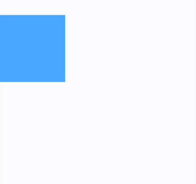
ref for an element is test, you can start an animation with this.$refs.test.The following table lists all legal parameters of options:
| Property | Describe |
|---|---|
| styles | specifies the names and values of styles to which a transition effect should be applied. |
| duration | specifies the duration of animation execution, the default value is 0, meaning that the component get the desired property immediately. |
| delay | specifies the waiting time before the animation starts. The default value is 0. |
| needLayout | Whether the animation execution affects the layout, the default value is false. |
| timingFunction | Describes the speed curve of animation execution, which is used to describe the mapping relationship between the elapsed time of animation and the progress of animation completion. The default value is linear, which means the animation has the same speed from start to finish. See below |
The supported styles are listed below:
| Property | Describe |
|---|---|
| width | Indicate the width value applied to the component after the animation is executed. Set needLayout to true if you need to influence the layout. The default value is computed width. |
| height | Indicate the height value applied to the component after the animation is executed. Set needLayout to true if you need to influence the layout. The default value is computed width. |
| backgroundColor | The background color applied to the component after the animation is executed, the default value is computed backgroundColor. |
| opacity | Indicate the opacity value applied to the component after the animation is executed, the default value is computed opacity. |
| transformOrigin | transformOrigin defines the central point of the change process, such as transformOrigin: x-axis y-axis parameter x-axis can be left, center, right, length or percentage, and parameter y-axis can be top, center, bottom, length or percentage. The default value is center center. |
| transform | The transformation type of transform may include rotate, translate, scale and other attributes. The default value is null. See details below |
transform
| Property | Describe |
|---|---|
| translate/translateX/translateY | Specify the location to which the element is to be moved. In length or percentage, and the default value is 0. |
| rotate/rotateX/rotateY | v0.16+ specifies the angle at which the element will be rotated. In degree, and the default value is 0 |
| scale/scaleX/scaleY | Enlarge or reduce the element in proportion. In number, and the default value is 1 |
| perspective | v0.16+ the distance from the observer to the z=0 plane, which is valid in Android 4.1 and above. In number, and the default value is positive infinity. |
timingFunction
| Property | Describe |
|---|---|
| linear | The animation speed is the same from beginning to end |
| ease-in | Animation speed from slow to fast |
| ease-out | Animation speed from fast to slow |
| ease-in-out | The animation first accelerates to the middle point and then decelerates to the end point |
| cubic-bezier(x1, y1, x2, y2) | Define the change process in cubic Bessel function, and the parameter value of the function must be between 0 and 1. For more information about cubic bezier, please refer to cubic-bezier and Bézier curve. |
Notice
animation is successfully executed. There are two result parameters in the callback, namely Success and Fail.If you need to use CSS animation, refer to transition and transform.
uni-app is the separation of the logical layer and the view layer. At this point, two layers of communication costs will be incurred. Dragging elements in the view layer, for example, might not be a smooth experience due to communication loss if events are constantly received in the logic layer.
BindingX is a pre-description interaction syntax provided by weex. Analyze the BindingX rule by native, and handle the interaction and dynamic effect of the view layer according to this rule. No more real-time de-js logic layer running and communicating.
BindingX is a rule, fast parsing, but not as flexible as js.
uni-app has built-in BindingX, which can be used in nvue to complete complex animation effects.
From HBuilderX 2.3.4+, the uni-app compilation mode can directly reference the uni.requireNativePlugin('bindingx') module, and the weex mode also needs to use npm to reference.
For the BindingX demo example, please refer to the relevant examples of vue in the BindingX example, and copy the relevant vue code to the nvue file.
origin in expression for now <template>
<view class="container">
<view ref="b1" class="btn" style="background-color:#6A1B9A" @click="clickBtn">
<text class="text">A</text>
</view>
<view ref="b2" class="btn" style="background-color:#0277BD" @click="clickBtn">
<text class="text">B</text>
</view>
<view ref="b3" class="btn" style="background-color:#FF9800" @click="clickBtn">
<text class="text">C</text>
</view>
<view ref="main_btn" class="btn" @click="clickBtn">
<image class="image" ref="main_image" src="https://gw.alicdn.com/tfs/TB1PZ25antYBeNjy1XdXXXXyVXa-128-128.png" />
</view>
</view>
</template>
<script>
const Binding = uni.requireNativePlugin('bindingx');
module.exports = {
data() {
return {
isExpanded: false
}
},
methods: {
getEl: function(el) {
if (typeof el === 'string' || typeof el === 'number') return el;
if (WXEnvironment) {
return el.ref;
} else {
return el instanceof HTMLElement ? el : el.$el;
}
},
collapse: function() {
let main_btn = this.getEl(this.$refs.main_btn);
let main_image = this.getEl(this.$refs.main_image);
let b1 = this.getEl(this.$refs.b1);
let b2 = this.getEl(this.$refs.b2);
let b3 = this.getEl(this.$refs.b3);
let main_binding = Binding.bind({
eventType: 'timing',
exitExpression: 't>800',
props: [{
element: main_image,
property: 'transform.rotateZ',
expression: 'easeOutQuint(t,45,0-45,800)'
}, {
element: main_btn,
property: 'background-color',
expression: "evaluateColor('#607D8B','#ff0000',min(t,800)/800)"
}]
}, function(res) {
if (res.state === 'exit') {
Binding.unbind({
token: main_binding.token,
eventType: 'timing'
})
}
});
let btn_binding = Binding.bind({
eventType: 'timing',
exitExpression: 't>800',
props: [{
element: b1,
property: 'transform.translateY',
expression: "easeOutQuint(t,-150,150,800)"
}, {
element: b2,
property: 'transform.translateY',
expression: "t<=100?0:easeOutQuint(t-100,-300,300,700)"
}, {
element: b3,
property: 'transform.translateY',
expression: "t<=200?0:easeOutQuint(t-200,-450,450,600)"
}]
}, function(res) {
if (res.state === 'exit') {
Binding.unbind({
token: btn_binding.token,
eventType: 'timing'
})
}
})
},
expand: function() {
let main_btn = this.getEl(this.$refs.main_btn);
let main_image = this.getEl(this.$refs.main_image);
let b1 = this.getEl(this.$refs.b1);
let b2 = this.getEl(this.$refs.b2);
let b3 = this.getEl(this.$refs.b3);
let main_binding = Binding.bind({
eventType: 'timing',
exitExpression: 't>100',
props: [{
element: main_image,
property: 'transform.rotateZ',
expression: 'linear(t,0,45,100)'
}, {
element: main_btn,
property: 'background-color',
expression: "evaluateColor('#ff0000','#607D8B',min(t,100)/100)"
}]
}, function(res) {
if (res.state === 'exit') {
Binding.unbind({
token: main_binding.token,
eventType: 'timing'
})
}
});
let btn_binding = Binding.bind({
eventType: 'timing',
exitExpression: 't>800',
props: [{
element: b1,
property: 'transform.translateY',
expression: "easeOutBounce(t,0,0-150,800)"
}, {
element: b2,
property: 'transform.translateY',
expression: "t<=100?0:easeOutBounce(t-100,0,0-300,700)"
}, {
element: b3,
property: 'transform.translateY',
expression: "t<=200?0:easeOutBounce(t-200,0,0-450,600)"
}]
}, function(res) {
if (res.state === 'exit') {
Binding.unbind({
token: btn_binding.token,
eventType: 'timing'
})
}
})
},
clickBtn: function(e) {
if (this.isExpanded) {
this.collapse();
} else {
this.expand();
}
this.isExpanded = !this.isExpanded;
}
}
}
</script>
<style>
.container {
flex: 1;
}
.image {
width: 60px;
height: 60px;
}
.text {
color: #ffffff;
font-size: 30px;
}
.btn {
width: 100px;
height: 100px;
background-color: #ff0000;
align-items: center;
justify-content: center;
position: absolute;
border-radius: 50px;
bottom: 25px;
right: 25px;
}
</style>

In uni-app, nvue and vue pages can be mixed and used.
It is recommended to use uni.$on , uni.$emit for page communication, and the old communication methods (uni.postMessage and plus.webview.postMessageToUniNView) are no longer recommended.
	// $on(eventName, callback)
	uni.$on('page-popup', (data) => {
	    console.log('标题:' + data.title)
	})

	// $emit(eventName, data)
	uni.$emit('page-popup', {
	    title: '我是title',
	});
**Note when communicating with this page: To remove the event listener using uni.$off before the page is unloaded. **Reference
	<!-- test.nvue -->
	<template>
	    <view @click="test">
	        <text>点击页面发送数据</text>
	    </view>
	</template>
	<script>
	    export default {
	        methods: {
	            test(e) {
	            }
	        }
	    }
	</script>
	<!-- App.vue -->
	<script>
	    export default {
	        onUniNViewMessage:function(e){
				console.log(JSON.stringify(e.data))
	        },
	        onLaunch: function() {
	            console.log('App Launch');
	        }
	    }
	</script>
vue 里使用 plus.webview.postMessageToUniNView(data,nvueId) 发送消息,data 为 JSON 格式(键值对的值仅支持String),nvueId 为 nvue 所在 webview 的 id,webview的 id 获取方式参考:$getAppWebview()。nvue, refer to the globalEvent module to listen to the plusMessage event, as follows: const globalEvent = uni.requireNativePlugin('globalEvent');
globalEvent.addEventListener("plusMessage", e => {
});
	<!-- index.nvue -->
	<template>
	    <div @click="test">
	        <text>点击页面发送数据{{num}}</text>
	    </div>
	</template>
	<script>
	    const globalEvent = uni.requireNativePlugin('globalEvent');
	    export default {
	        data() {
	            return {
	                num: "0"
	            }
	        },
	        created() {
	            globalEvent.addEventListener("plusMessage", e => {
	                console.log(e.data);
	                    this.num = e.data.num
	                }
	            });
	        },
	        methods: {
	            test(e) {
	                uni.navigateTo({
	                    url: '../test/test'
	                })
	            }
	        }
	    }
	</script>
	<!-- test.vue -->
	<template>
	    <view>
	        <button type="primary" @click="test">点击改变nvue的数据</button>
	    </view>
	</template>
	<script>
	    export default {
	        methods: {
	            test() {
	                var pages = getCurrentPages();
	                var page = pages[pages.length - 2];
	                var currentWebview = page.$getAppWebview();
	                plus.webview.postMessageToUniNView({
	                    num: "123"
	                }, currentWebview.id);
	                uni.navigateBack()
	            }
	        }
	    }
	</script>
In addition to communicating events, variables and storage can be shared between vue and nvue pages. The scheme for shared variables and data provided by uni-app is as follows:
vuex. This is the official state management tool of vue.Note: Direct introduction of
storeis not supported, you can use helper methods such asmapState,mapGetters,mapMutationsor usethis.$store
uni.storage storage. This storage is persistent. For example, the login status can be saved here.plus.sqlite, which is also shared and common.globalData mechanism, which can also be used in uni-app, and is universal to all terminals. Define globalData in the App.vue file as follows: <script>
export default {
globalData: {
text: 'text'
},
onLaunch: function() {
console.log('App Launch')
},
onShow: function() {
console.log('App Show')
},
onHide: function() {
console.log('App Hide')
}
}
</script>
globalData in js is as follows: getApp().globalData.text = 'test'globalData to the page, you can reassign the variable in the onShow life cycle of the page.The nvue page can directly use the plus API, and does not need to wait for the plus ready.
nvue supports most uni-app APIs. The following only lists the APIs that are not currently supported.
| API | Describe | Solution |
|---|---|---|
| uni.createAnimation() | Create an animation instance | animation |
| API | Describe | Solution |
|---|---|---|
| uni.pageScrollTo() | Scroll the page to the target position | scrollToElement |
| API | Describe |
|---|---|
| uni.createIntersectionObserver() | Create and return an example of the IntersectionObserver object |
For the usage of canvas API, please refer to canvas document.