

English
If you already know Vue2 and just want to know the new features of Vue3, please refer to New features of vue3 (opens new window)!
There are already Vue 2 projects, and those that need to adapt to Vue 3 can be referred to Vue2 project migration vue3 (opens new window)!
<template>, and there can be multiple root <view> components in App and H5 under this <template>.The following is an example of a basic component. Under the root <view> component, introduce a <view> component again, and bind a data to the text area of the component.
	<template>
		<view>
			<text>{{userName}}</text>
		</view>
	</template>
	<script>
		export default {
			data() {
				return {
					"userName":"foo"
				}
			}
		}
	</script>
The basic components are built into the framework of uni-app, including dozens of basic components such as view, text, input, button, and video. The list is detailed in: uni-app basic components (opens new window).
But basic components alone are not enough. There will be many encapsulated components in actual development.
For example, if we need a pentagram click rating component, it is available in the DCloud plug-in market: https://ext.dcloud.net.cn/plugin?id=33 (opens new window)
Import this uni-rate component into your uni-app project, refer to it in the required vue page, and the pentagram component can be displayed in the specified place.
	<!-- Refer the uni-rate component on the index.vue page -->
	<template>
		<view>
			<uni-rate></uni-rate><!-- A five-pointed star will be displayed here, and  will be automatically lit after clicking on it -->
		</view>
	</template>
When registering a component, we always need to give it a name. There are two ways to define component names:
When using kebab-case (name separated by dashes) to define a component, you must also use kebab-case when referencing this custom element, for example <my-component-name>.
When defining a component using PascalCase (name with initial capital letters), you can use both nomenclatures when referencing this custom element.
Both <my-component-name>and <MyComponentName>are acceptable.
Create and store custom components in the components directory under the root directory of the uni-app project:
	│─components            	uni-app component directory that conforms to the vue component specification
	│  └─componentA         	If conforming to the directory structure of ‘components/component name/component name.vue’, the easycom can directly use the components
	│  		└─componentA.vue    reusable componentA component
	│  └─component-a.vue      reusable component-a component
uni-app supports the configuration of global components. Global registration is required in main.js, and the component can be used in all pages after registration.
Note
main.js import App from './App'
import {createSSRApp} from 'vue'
//import components
import myComponent from './components/my-component/my-component.vue'
export function createApp() {
const app = createSSRApp(App)
//invoke app.component
app.component('my-component', myComponent)
return {
app
}
}
index.vue <template>
<view>
<my-component></my-component>
</view>
</template>
Before partial registration, import the component you want to use on the page that needs to reference the component.
The way the page introduces components
The following two ways to import a corner label component libraryhttps://ext.dcloud.net.cn/plugin?id=21 (opens new window), recommended to use easycom to introduce.
import ,and define the componentsyou want to use in the Components option. <!-- Introduce the uni-badge component in index.vue -->
<template>
<view>
<uni-badge text="1"></uni-badge><!-- 3. Use components -->
</view>
</template>
<script>
//1. Import components (This step belongs to the traditional VUE specification)
import uniBadge from '@/components/uni-badge/uni-badge.vue';
export default {
//2. Registration of Components (This step belongs to the traditional VUE specification)
components:{uniBadge }
}
</script>
For the componentsobject of each property, its property name is the name of the custom elements, objects whose property value is the option of this component.
Putting a variable name similar to uniBadge in the object is actually uniBadge: short for uniBadge, that is, the variable name is also:
componentsdirectory, and in accordance with components/component-name/component-name.vuethe directory structure. You can use it directly on the page without quoting or registering. <!-- Introduce the uni-badge component in index.vue -->
<template>
<view>
<uni-badge text="1"></uni-badge><!-- 3. Use components -->
</view>
</template>
<script>
// There is no need to import or register a uni-badge component in Components. Template can be used directly
export default {
data() {
return {
}
}
}
</script>
Easycom (opens new window) is automatically turned on , you do not need to manually open ,when there is a demand pages.jsonof easycomnodes personalize .
No matter how many components are installed in the components directory, easycom will automatically remove unused components after packaging, which is particularly friendly to the use of component libraries.
Component is a very important part of the technology in vue.Components allow UI-related wheels to be easily manufactured and shared, which in turn makes development efficiency for vueusers significantly higher.
uni-app has built a component plug-in market, and there are many ready-made components. If you download the components of the Comply with components/ component name/ component name.vue directory structure, you can use them directly. uni-app plug-in market (opens new window)
uni-apponly supports vue single file components (.vue components). Others such as: dynamic components, customrender, and<script type="text/x-template">String template, are not supported at non-H5 sides.
propsCan be an array or object, used to receive data from the parent component. propsIt can be a simple array, or use an object as an alternative. The object allows configuration of advanced options such as type detection, custom validation, and setting default values.
| Options | Types of | Description |
|---|---|---|
| type | String, Number, Boolean, Array, Object, Date, Function, SymbolArray, any custom constructor, or the above composition | A checks propwhether the given type, otherwise throws a warning |
| default | any | For propa default value specified. If this propis not passed, then the change to do with this value. The default value of the object or array must be returned from a factory function. |
| required | Boolean | The definition of propwhether it is required |
| validator | Function | The custom authentication function propvalue as the only parameter is substituted. In a non-production environment, if the function returns a falsyvalue (that is, authentication fails), a warning will be thrown console |
	<template>
		<view>
			<!-- I am the child component componentA -->
			<view>{{age}}</view>
		</view>
	</template>
	<script>
		export default {
			props: {
				// Detection type + other validation
				age: {
					type: Number,
					default: 0,
					required: true,
					validator: function(value) {
						return value >= 0
					}
				}
			}
		}
	</script>
	<template>
		<view>
			<!-- I am the parent component -->
			<componentA :age="10"></componentA>
		</view>
	</template>
proppassed in a static value: <blog-post title="My journey with Vue"></blog-post>
v-bind assigned dynamically,such as in: <!-- Dynamically assign the value of a variable -->
<blog-post :title="post.title"></blog-post>
<!-- Dynamically assign the value of a complex expression -->
<blog-post :title="post.title + ' by ' + post.author.name"></blog-post>
In the two examples above, we happen to pass string values, but any type of value can actually be passed to a prop.
	<!-- Even though `42` is static, we need v-bind to tell Vue that -->
	<!-- this is a JavaScript expression rather than a string. -->
	<blog-post :likes="42"></blog-post>

	<!-- Dynamically assign to the value of a variable. -->
	<blog-post :likes="post.likes"></blog-post>
	<!-- Including the prop with no value will imply `true`. -->
	<blog-post is-published></blog-post>

	<!-- Even though `false` is static, we need v-bind to tell Vue that -->
	<!-- this is a JavaScript expression rather than a string.  -->
	<blog-post :is-published="false"></blog-post>

	<!-- Dynamically assign to the value of a variable. -->
	<blog-post :is-published="post.isPublished"></blog-post>
	<!-- Even though the array is static, we need v-bind to tell Vue that -->
	<!-- this is a JavaScript expression rather than a string.  -->
	<blog-post :comment-ids="[234, 266, 273]"></blog-post>

	<!-- Dynamically assign to the value of a variable. -->
	<blog-post :comment-ids="post.commentIds"></blog-post>
	<!-- Even though the object is static, we need v-bind to tell Vue that -->
	<!-- this is a JavaScript expression rather than a string.  -->
	<blog-post :author="{ name: 'Veronica',company: 'Veridian Dynamics'}"></blog-post>

	<!-- Dynamically assign to the value of a variable. -->
	<blog-post :author="post.author"></blog-post>
If you want to pass all the properties of an object as props, you can use v-bind without an argument (v-bind instead of :prop-name). For example, given a post object:
	post: {
		id: 1,
		title: 'My Journey with Vue'
	}
	<blog-post v-bind="post"></blog-post>
	<!-- The above template is equivalent to: -->
	<blog-post v-bind:id="post.id" v-bind:title="post.title"></blog-post>
All props form a one-way-down binding between the child property and the parent one: when the parent property updates, it will flow down to the child, but not the other way around. This prevents child components from accidentally mutating the parent's state, which can make your app's data flow harder to understand.
In addition, every time the parent component is updated, all props in the child component will be refreshed with the latest value. This means you should not attempt to mutate a prop inside a child component. If you do, Vue will warn you in the console.
There are usually two cases where it's tempting to mutate a prop:
	<template>
		<view>
			<!--I am the child component componentA -->
			<view>{{myTitle}}</view>
		</view>
	</template>
	<script>
		export default {
			props: ['title'],
			data() {
				return {
					myTitle:this.title
				}
			}
		}
	</script>
	<template>
		<view>
			<!-- I am the parent component -->
			<componentA :title="title"></componentA>
		</view>
	</template>
	<script>
		export default {
			data() {
				return {
					title:"hello"
				}
			}
		}
	</script>
	<template>
		<view>
			<!-- I am the child component Component A -->
			<view>{{normalizedSize}}</view>
		</view>
	</template>
	<script>
		export default {
			props: ['size'],
			computed: {
				normalizedSize: function () {
					return this.size.toLowerCase()
				}
			}
		}
	</script>
	<template>
		<view>
			<!-- I am the parent component -->
			<componentA :size="size"></componentA>
		</view>
	</template>
	<script>
		export default {
			data() {
				return {
					size:"M"
				}
			}
		}
	</script>
tips
Note that objects and arrays in JavaScript are passed by reference, so if the prop is an array or object, mutating the object or array itself inside the child component will affect parent state.
Components can specify requirements for their props, such as the types you've already seen. If a requirement isn't met, Vue will warn you in the browser's JavaScript console. This is especially useful when developing a component that's intended to be used by others.
To specify prop validations, you can provide an object with validation requirements to the value of props, instead of an array of strings. For example:
	props: {
		// Basic type check (`null` and `undefined` values will pass any type validation)
		propA: Number,
		// Multiple possible types
		propB: [String, Number],
		// Required string
		propC: {
			type: String,
			required: true
		},
		// Number with a default value
		propD: {
			type: Number,
			default: 100
		},
		// Object with a default value
		propE: {
			type: Object,
			// Object or array defaults must be returned from a factory function
			default: function() {
			  return { message: 'hello' }
			}
		},
		// Custom validator function
		propF: {
			validator: function(value) {
				// The value must match one of these strings
			  return ['success', 'warning', 'danger'].indexOf(value) !== -1
			}
		},
		// Function with a default value
		propG: {
			type: Function,
			// Unlike object or array default, this is not a factory function - this is a function to serve as a default value
			default: function() {
			  return 'Default function'
			}
		}
	}
When prop validation fails, Vue will produce a console warning (if using the development build).
tips
Note that props are validated before a component instance is created, so instance properties (e.g. data, computed, etc) will not be available inside default or validator functions.
Type Checks
The type can be one of the following native constructors:
StringNumberBooleanArrayObjectDateFunctionSymbolIn addition, type can also be a custom constructor function and the assertion will be made with an instanceof check. For example, given the following constructor function exists:
	function Person(firstName, lastName) {
		this.firstName = firstName
		this.lastName = lastName
	}
You could use:
	props: {
		author: Person
	}
to validate that the value of the author prop was created with new Person
HTML attribute names are case-insensitive, so browsers will interpret any uppercase characters as lowercase. That means when you're using in-DOM templates, camelCased prop names need to use their kebab-cased (hyphen-delimited) equivalents:
	<template>
		<view>
			<!-- I am the child component Component A -->
			<view>{{postTitle}}</view>
		</view>
	</template>

	<script>
		export default {
			props: ['postTitle']
		}
	</script>
	<template>
		<view>
			<!-- I am the parent component -->
			<componentA post-title="hello!"></componentA>
		</view>
	</template>
A component non-prop attribute is an attribute or event listener that is passed to a component, but does not have a corresponding property defined in props or emits. Common examples of this include class, style, and id attributes. You can access those attributes via $attrs property.
When a component returns a single root node, non-prop attributes will automatically be added to the root node's attributes. For example, in the instance of a date-picker component:
	<!-- date-picker -->
	<template>
		<view class="date-picker">
		  <input type="datetime" />
		</view>
	</template>
In the event we need to define the status of the date-picker component via a data-status attribute, it will be applied to the root node (i.e., div.date-picker).
	<!-- Date-picker component with a non-prop attribute -->
	<date-picker data-status="activated"></date-picker>

	<!-- Rendered date-picker component -->
	<div class="date-picker" data-status="activated">
		<input type="datetime" />
	</div>
Same rule applies to the event listeners:
<date-picker @change="submitChange"></date-picker>
	// date-picker
	export default {
		created() {
		  console.log(this.$attrs) // { onChange: () => {}  }
		}
	}
This might be helpful when we have an HTML element with change event as a root element of date-picker.
	<!-- date-picker -->
	<template>
		<select>
		  <option value="1">Yesterday</option>
		  <option value="2">Today</option>
		  <option value="3">Tomorrow</option>
		</select>
	</template>
In this case, change event listener is passed from the parent component to the child and it will be triggered on native <select> change event. We won't need to emit an event from the date-picker explicitly:
	<template>
		<view id="date-picker" class="demo">
			<date-picker @change="showChange"></date-picker>
		</view>
	</template>
	<script>
		export default {
			methods: {
				showChange(event) {
					// will log a value of the selected option
					console.log(event,event.target.value)
				}
			}
		}
	</script>
If you do not want a component to automatically inherit attributes, you can set inheritAttrs: false in the component's options.
The common scenario for disabling an attribute inheritance is when attributes need to be applied to other elements besides the root node.
By setting the inheritAttrs option to false, you can control to apply to other elements attributes to use the component's $attrs property, which includes all attributes not included to component props and emits properties (e.g., class, style, v-on listeners, etc.).
Using our date-picker component example from the previous section, in the event we need to apply all non-prop attributes to the input element rather than the root div element, this can be accomplished by using the v-bind shortcut.
	<template>
		<view class="date-picker">
		  <input type="datetime" v-bind="$attrs" />
		</view>
	</template>
	<script>
		export default {
			inheritAttrs: false
		}
	</script>
With this new configuration, our data-status attribute will be applied to our input element!
	// Date-picker component with a non-prop attribute
	<date-picker data-status="activated"></date-picker>

	// Rendered date-picker component
	<view class="date-picker">
		<input type="datetime" data-status="activated" />
	</view>
Unlike single root node components, components with multiple root nodes do not have an automatic attribute fallthrough behavior. If $attrs are not bound explicitly, a runtime warning will be issued.
<custom-layout id="custom-layout" @click="changeValue"></custom-layout>
	<!-- custom-layout -->
	<!-- This will raise a warning -->
	<template>
		<header>...</header>
		<main>...</main>
		<footer>...</footer>
	</template>

	<!-- No warnings, $attrs are passed to <main> element -->

	<template>
		<header>...</header>
		<main v-bind="$attrs">...</main>
		<footer>...</footer>
	</template>
Like components and props, event names provide an automatic case transformation. If you emit an event from the child component in camel case, you will be able to add a kebab-cased listener in the parent:
this.$emit('myEvent')
listening to the kebab-case (dash-separated) version of this name will not have any effect:
	<!-- No effect -->
	<my-component @my-event="doSomething"></my-component>
Unlike components and prop, the event name will not be used as a JavaScript variable name or property name, so there is no reason to use camelCase (hump nomenclature) or PascalCase (Pascal nomenclature). Also, the v-on event listener will be automatically converted to all lowercase in the DOM template (because HTML is case insensitive), so @myEvent will become @myevent. As a result, myEvent cannot be listened to.
Therefore, we recommend that you always use kebab-case (dash-separated) event names.
Emitted events can be defined on the component via the emits option.
	// in component
	export default {
		emits: ['in-focus', 'submit']
	}
When a native event (e.g., click) is defined in the emits option, the component event will be used instead of a native event listener.
It is recommended to define all emitted events in order to better document how a component should work.
Example
	<template>
		<view>
			<!-- This is counter component -->
			<view>counter value is: {{count}}</view>
			<button type="default" @click="add">+1</button>
		</view>
	</template>
	<script>
		export default {
			//1. Declare a custom event: a custom event of the component, which must be declared in the emits node beforehand
			emits:['count-change'],
			data() {
				return {
					count:0
				};
			},
			methods:{
				add(){
					this.count++
					//2. Trigger the custom event: when +1 button is clicked, call this.$emit() method to trigger the custom count-change event
					this.$emit('count-change')
				}
			}
		}
	</script>
	<template>
		<view>
			<!-- This is parent component -->
			<!-- 3. listen to the custom events: listen to custom events in the form of v-on -->
			<counter @count-change="getCount"></counter>
		</view>
	</template>
	<script>
		export default {
			methods: {
				getCount(){
					console.log("triggered the custom event of count-change")
				}
			}
		}
	</script>
Validate Emitted Events
Similar to prop type validation, an emitted event can be validated if it is defined with the Object syntax instead of the array syntax.
To add validation, the event is assigned a function that receives the arguments passed to the $emit call and returns a boolean to indicate whether the event is valid or not.
	export default {
		emits: {
			// No validation
			click: null,

			// Validate submit event
			submit: ({ email, password }) => {
				if (email && password) {
					return true
				} else {
					console.warn('Invalid submit event payload!')
					return false
				}
			}
		},
		methods: {
			submitForm() {
				this.$emit('submit', { email, password })
			}
		}
	}
By default, v-model on a component uses modelValue as the prop and update:modelValue as the event. We can modify these names passing an argument to v-model:
<my-component v-model:foo="bar"></my-component>
In this case, child component will expect a foo prop and emits update:foo event to sync:
	<template>
		<view>
			<input type="text" :value="foo" @input="$emit('update:foo', $event.target.value)" >
		</view>
	</template>
	<script>
		export default {
			props: {
			  foo: String
			}
		}
	</script>
<my-component v-model:foo="bar"></my-component>
Example
	<template>
		<view>
			<view>Parent-component - count value is: {{count}}</view>
			<button type="default" @click="count +=1">+1</button>
			<counter v-model:number="count"></counter>
		</view>
	</template>
	<script>
		export default {
			data() {
				return {
					count:0
				}
			}
		}
	</script>
	<!-- counter -->
	<template>
		<view>
			  <view>Sub-component - count value is: {{number}}</view>
			  <button type="default" @click="add">+1</button>
		</view>
	</template>
	<script>
		export default {
			props:['number'],
			emits:['update:number'],
			methods:{
				add(){
					//The subcomponent modifies the number value through this.$emit() method
					this.$emit('update:number',this.number +1)
				}
			}
		}
	</script>
By leveraging the ability to target a particular prop and event as we learned before with v-model arguments, we can now create multiple v-model bindings on a single component instance.
Each v-model will sync to a different prop, without the need for extra options in the component:
	<template>
		<view>
			<!-- parent -->
			<user-name
			  v-model:first-name="firstName"
			  v-model:last-name="lastName"
			></user-name>
		</view>
	</template>
	<script>
		export default {
			data() {
				return {
					firstName:"",
					lastName:""
				}
			}
		}
	</script>
	<!-- user-name -->
	<template>
		<view>
			<input type="text" :value="firstName" @input="$emit('update:firstName', $event.target.value)">
			<input type="text" :value="lastName" @input="$emit('update:lastName', $event.target.value)">
		</view>
	</template>
	<script>
		export default {
			props: {
				firstName: String,
				lastName: String
			}
		}
	</script>
Let's create an example custom modifier, capitalize, that capitalizes the first letter of the string provided by the v-model binding.
Modifiers added to a component v-model will be provided to the component via the modelModifiers prop. In the below example, we have created a component that contains a modelModifiers prop that defaults to an empty object.
Notice that when the component's created lifecycle hook triggers, the modelModifiers prop contains capitalize and its value is true - due to it being set on the v-model binding v-model.capitalize="myText".
	<!-- parent -->
	<template>
		<view>
			<my-component v-model.capitalize="myText"></my-component>
		</view>
	</template>
	<script>
		export default {
			data() {
				return {
					myText:""
				}
			}
		}
	</script>
	<!-- my-component -->
	<template>
		<view>
			<input type="text" :value="modelValue" @input="emitValue" style="border: red solid 1px;">
		</view>
	</template>
	<script>
		export default {
			props: {
				modelValue: String,
				modelModifiers: {
					default: () => ({})
				}
			},
			created() {
				console.log(this.modelModifiers) // { capitalize: true }
			},
			methods: {
				emitValue(e) {
					let value = e.target.value
					if (this.modelModifiers.capitalize) {
						value = value.charAt(0).toUpperCase() + value.slice(1)
					}
					//charAt() ***
					//toUpperCase() ***
					//slice() ***
					console.log("value: ",value);
					this.$emit('update:modelValue', value)
				}
			}
		}
	</script>
For v-model bindings with arguments, the generated prop name will be arg + "Modifiers":
<my-component v-model:foo.capitalize="bar"></my-component>
	<!-- parent -->
	<template>
		<view>
			<input type="text"
			  :value="foo"
			  @input="$emit('update:foo', $event.target.value)">
		</view>
	</template>
	<script>
		export default {
			props: ['foo', 'fooModifiers'],
			created() {
			  console.log(this.fooModifiers) // { capitalize: true }
			}
		}
	</script>
Vue implements a content distribution API inspired by the Web Components spec draft (opens new window) (opens new window), using the <slot> element to serve as distribution outlets for content.
This allows you to compose components like this:
	<todo-button>
		Add todo
	</todo-button>
Then in the template for <todo-button>, you might have:
	<!-- todo-button component template -->
	<button class="btn-primary">
		<slot></slot>
	</button>
When the component renders, <slot></slot> will be replaced by "Add Todo".
	<!-- rendered HTML -->
	<button class="btn-primary">
		Add todo
	</button>
Strings are just the beginning though! Slots can also contain any template code, including HTML:
	<todo-button>
		<!-- Add a Font Awesome icon -->
		<i class="fas fa-plus"></i>
		Add todo
	</todo-button>
Or even other components:
	<todo-button>
		<!-- Use a component to add an icon -->
		<font-awesome-icon name="plus"></font-awesome-icon>
		Add todo
	</todo-button>
If <todo-button>'s template did not contain a <slot> element, any content provided between its opening and closing tag would be discarded.
	<!-- todo-button component template -->
	<button class="btn-primary">
		Create a new item
	</button>
	<todo-button>
		<!-- Following text won't be rendered -->
		Add todo
	</todo-button>
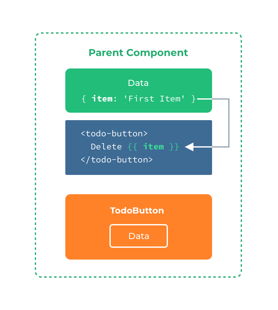
When you want to use data inside a slot, such as in:
	<todo-button>
		Delete a {{ item.name }}
	</todo-button>
That slot has access to the same instance properties (i.e. the same "scope") as the rest of the template.
The slot does not have access to <todo-button>'s scope. For example, trying to access action would not work:
	<todo-button action="delete">
		Clicking here will {{ action }} an item
		<!-- The `action` will be undefined, because this content is passed _to_ <todo-button>, rather than defined _inside_ the <todo-button> component. -->
	</todo-button>
As a rule, remember that: Everything in the parent template is compiled in parent scope; everything in the child template is compiled in the child scope.
There are cases when it's useful to specify fallback (i.e. default) content for a slot, to be rendered only when no content is provided. For example, in a <submit-button> component:
	<button type="submit">
		<slot></slot>
	</button>
We might want the text "Submit" to be rendered inside the <button> most of the time. To make "Submit" the fallback content, we can place it in between the <slot> tags:
	<button type="submit">
		<slot>Submit</slot>
	</button>
Now when we use <submit-button> in a parent component, providing no content for the slot:
<submit-button></submit-button>
will render the fallback content, "Submit":
	<button type="submit">
		Submit
	</button>
But if we provide content:
	<submit-button>
		Save
	</submit-button>
Then the provided content will be rendered instead:
	<button type="submit">
		Save
	</button>
There are times when it's useful to have multiple slots. For example, in a <base-layout> component with the following template:
	<!-- base-layout -->
	<view class="container">
		<header>
		<!-- We want header content here -->
		</header>
		<main>
		<!-- We want main content here -->
		</main>
		<footer>
		<!-- We want footer content here -->
		</footer>
	</view>
For these cases, the <slot> element has a special attribute, name, which can be used to assign a unique ID to different slots so you can determine where content should be rendered:
	<view class="container">
		<header>
			<slot name="header"></slot>
		</header>
		<main>
			<slot></slot>
		</main>
		<footer>
			<slot name="footer"></slot>
		</footer>
	</view>
A <slot> outlet without name implicitly has the name "default".
To provide content to named slots, we need to use the v-slot directive on a <template> element, providing the name of the slot as v-slot's argument:
	<template>
		<view>
		<!-- base-layout -->
			<base-layout>
				<template v-slot:header>
					<view>Here might be a page title</view>
				</template>
				<template v-slot:default>
					<view>A paragraph for the main content.</view>
					<view>And another one.</view>
				</template>
				<template v-slot:footer>
					<view>Here's some contact info</view>
				</template>
			</base-layout>
		</view>
	</template>
Now everything inside the <template> elements will be passed to the corresponding slots.
The rendered HTML will be:
	<div class="container">
		<header>
			<div>Here might be a page title</div>
		</header>
		<main>
			<div>A paragraph for the main content.</div>
			<div>And another one.</div>
		</main>
		<footer>
			<div>Here's some contact info</div>
		</footer>
	</div>
Note that v-slot can only be added to a <template> (with one exception)
Similar to v-on and v-bind, v-slot also has a shorthand, replacing everything before the argument (v-slot:) with the special symbol #. For example, v-slot:header can be rewritten as #header:
	<base-layout>
		<template #header>
			<view>Here might be a page title</view>
		</template>

		<template #default>
			<view>A paragraph for the main content.</view>
			<view>And another one.</view>
		</template>

		<template #footer>
			<view>Here's some contact info</view>
		</template>
	</base-layout>
However, just as with other directives, the shorthand is only available when an argument is provided. That means the following syntax is invalid:
	<!-- This will trigger a warning -->
	<todo-list #="{ item }">
		<i class="fas fa-check"></i>
		<view class="green">{{ item }}</view>
	</todo-list>
Instead, you must always specify the name of the slot if you wish to use the shorthand:
	<todo-list #default="{ item }">
		<i class="fas fa-check"></i>
		<view class="green">{{ item }}</view>
	</todo-list>
Sometimes, it's useful for slot content to have access to data only available in the child component. It's a common case when a component is used to render an array of items, and we want to be able to customize the way each item is rendered.
For example, we have a component, containing a list of todo-items.
<template>
	<view>
		<view v-for="(item, index) in items">
        {{ item }}
      </view>
	</view>
</template>
<script>
	export default {
		data() {
			return {
				items: ['Feed a cat', 'Buy milk']
			};
		}
	}
</script>
We might want to replace the with a <slot> to customize it on parent component:
	<todo-list>
		<i class="fas fa-check">before--</i>
		<view class="green">{{ item }}</view>
	</todo-list>
That won't work, however, because only the <todo-list> component has access to the item and we are providing the slot content from its parent.
To make item available to the slot content provided by the parent, we can add a <slot> element and bind it as an attribute:
<template>
	<view>
		<view v-for="(item, index) in items">
		   <slot :item="item"></slot>
		</view>
	</view>
</template>
<script>
	export default {
		data() {
			return {
				items: ['Feed a cat', 'Buy milk']
			}
		}
	}
</script>
Attributes bound to a <slot> element are called slot props. Now, in the parent scope, we can use v-slot with a value to define a name for the slot props we've been provided:
<template>
	<view>
		<todo-list>
			<template v-slot:default="slotProps">
				<i class="fas fa-check"></i>
				<view class="green">{{ slotProps.item }}</view>
			</template>
		</todo-list>
	</view>
</template>

In this example, we've chosen to name the object containing all our slot props slotProps, but you can use any name you like.
In cases like above, when only the default slot is provided content, the component's tags can be used as the slot's template. This allows us to use v-slot directly on the component:
	<todo-list v-slot:default="slotProps">
		<i class="fas fa-check"></i>
		<view class="green">{{ slotProps.item }}</view>
	</todo-list>
This can be shortened even further. Just as non-specified content is assumed to be for the default slot, v-slot without an argument is assumed to refer to the default slot:
	<todo-list v-slot="slotProps">
		<i class="fas fa-check"></i>
		<view class="green">{{ slotProps.item }}</view>
	</todo-list>
Note that the abbreviated syntax for default slot cannot be mixed with named slots, as it would lead to scope ambiguity:
<!-- INVALID, will result in warning -->
	<todo-list v-slot="slotProps">
		<todo-list v-slot:default="slotProps">
			<i class="fas fa-check"></i>
			<view class="green">{{ slotProps.item }}</view>
		</todo-list>
		<template v-slot:other="otherSlotProps">
			slotProps is NOT available here
		</template>
	</todo-list>
Whenever there are multiple slots, use the full <template> based syntax for all slots:
	<todo-list>
		<template v-slot:default="slotProps">
			<i class="fas fa-check"></i>
			<view class="green">{{ slotProps.item }}</view>
		</template>

		<template v-slot:other="otherSlotProps">
			...
		</template>
	</todo-list>
Internally, scoped slots work by wrapping your slot content in a function passed a single argument:
function (slotProps) {
  // ... slot content ...
}
That means the value of v-slot can actually accept any valid JavaScript expression that can appear in the argument position of a function definition. So you can also use ES2015 (opens new window) destructuring (opens new window)to pull out specific slot props, like so:
	<todo-list v-slot="{ item }">
		<i class="fas fa-check"></i>
		<view class="green">{{ item }}</view>
	</todo-list>
This can make the template much cleaner, especially when the slot provides many props. It also opens other possibilities, such as renaming props, e.g. item to todo:
	<todo-list v-slot="{ item: todo }">
		<i class="fas fa-check"></i>
		<view class="green">{{ todo }}</view>
	</todo-list>
You can even define fallbacks, to be used in case a slot prop is undefined:
	<todo-list v-slot="{ item = 'Placeholder' }">
		<i class="fas fa-check"></i>
		<view class="green">{{ item }}</view>
	</todo-list>
The following are reserved keywords and can not be used as component names.
acanvascellcontentcountdowndatepickerdivelementembedheaderimageimgindicatorinputlinklistloading-indicatorloadingmarqueemetarefreshrichtextscriptscrollablescrollerselectslider-neighborsliderslotspanspinnerstylesvgswitchtabbartabheadertemplatetexttextareatimepickertransition-grouptransitionvideoviewwebTips