English
width:100%, cannot be usedbackground-image in css is not supported, but image components and layers can be used to achieve background effects similar to those in the web. Because in native development, there is no such concept of background map like web.image tag, support the use of base64, but not svg format imagesbackground-color is not set, it may cause ghosting problemstext component. In the text component, the content cannot be written in a new line, or otherwise there will be irremovable peripheral margins.text标签可以设置字体大小,字体颜色/deep/From HBuilderX 3.1.0+, more abbreviated styles are supported
borderborder-topborder-rightborder-bottomborder-leftborder-styleborder-widthborder-colorborder-radiusflex-flowbackgroundFrom HBuilderX 3.1.0+, new style compilation mode is supported
The newly added nvueStyleCompiler configuration supports combined selectors (adjacent brother selector, normal brother selector, child selector, descendant selector). See details
In the uni-app compilation mode of nvue, the styles in App.vue will be compiled into each nvue file. For shared styles, if there are illegal attributes, the console will give a warning, you can use conditional compilationAPP-PLUS-NVUE Suppress warnings in apps.
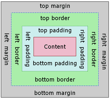
Weex box model based on the CSS box model, all of weex elements can be considered as boxes.
The term "box model" is used when talking about design and layout. The box model is essentially a box that wraps around every HTML element. It consists of margins, borders, paddings, and the actual content.
Weex only supports
box-sizing:border-box, in which box size includescontent,paddingandborder-widthand excludesmargin.
On Android, Weex only supports
overflow:hidden.
On iOS, Weex supports
overflow:hiddenandoverflow:visibleand by default, it isoverflow:visible.
	<template>
		<view>
			<image style="width: 400rpx; height: 200rpx; margin-left: 20rpx;" src="https://qiniu-web-assets.dcloud.net.cn/unidoc/zh/loveIcon.png"></image>
		</view>
	</template>
| Property | Describe |
|---|---|
| width {length} | width, default value 0 |
| height {length} | height, default value 0 |
padding specifies the space between element content and the element border. One can use shorthand for four edges or specify the padding for one edge:
| Property | Describe |
|---|---|
| padding {length} | padding for four edges, default value 0 |
| padding-left {length} | default value 0 |
| padding-right {length} | default value 0 |
| padding-top {length} | default value 0 |
| padding-bottom {length} | default value 0 |
border-style 设定边框样式,如果四个方向的边框样式不同,可分别设置:
border-style Set the border style. If the border styles in the four directions are different, you can set them separately:
| Property | Describe |
|---|---|
| border-left-style {string} | values solid / dashed / dotted, default value solid |
| border-top-style {string} | values solid / dashed / dotted, default value solid |
| border-right-style {string} | values solid / dashed / dotted, default value solid |
| border-bottom-style {string} | values solid / dashed / dotted, default value solid |
| Property | Describe |
|---|---|
| solid | The default value of the solid border is solid |
| dashed | Square dashed border |
| dotted | Dotted dashed border |
border-width:设定边框宽度,非负值, 默认值 0,如果四个方向的边框宽度不同,可分别设置:
border-width: Set the border width, non-negative value, the default value is 0, if the border widths in the four directions are different, you can set them separately:
| Property | Describe |
|---|---|
| border-width {length} | non-negative, default value 0 |
| border-left-width {length} | non-negative, default value 0 |
| border-top-width {length} | non-negative, default value 0 |
| border-right-width {length} | non-negative, default value 0 |
| border-bottom-width {length} | non-negative, default value 0 |
border-color:设定边框颜色,默认值 #000000,如果四个方向的边框颜色不同,可分别设置:
````border-color: Set the border color, the default value is #000000```, if the border colors in the four directions are different, you can set them separately:
| Property | Describe |
|---|---|
| border-color {color} | default value #000000 |
| border-left-color {color} | default value #000000 |
| border-top-color {color} | default value #000000 |
| border-right-color {color} | default value #000000 |
| border-bottom-color {color} | default value #000000 |
border-radius:设置边框的圆角,默认值 0,如果四个方向的圆角弧度不同,可分别设置:
border-radius: Set the rounded corners of the border, the default value is 0. If the rounded corners in the four directions are different, you can set them separately:
| Property | Describe |
|---|---|
| border-radius {length} | default value 0 which means the corner is a right angle. |
| border-bottom-left-radius {length} | non-negative, default value 0 |
| border-bottom-right-radius {length} | non-negative, default value 0 |
| border-top-left-radius {length} | non-negative, default value 0 |
| border-top-right-radius {length} | non-negative, default value 0 |
border-radius和border-width定义了圆心角为90度的椭圆弧的长轴和半长轴的大小。如果邻接两边border-radius或border-width不一致,nvue绘制的边框曲线可能不够平滑。
margin specifies the space around elements which is outside the border. One can use shorthand for four edges or specify the margin for one edge:
| Property | Describe |
|---|---|
| margin {length} | margin for four edges, default value 0 |
| margin-left {length} | margin for left edge, default value 0 |
| margin-right {length} | margin for left edge, default value 0 |
| margin-top {length} | margin for left edge, default value 0 |
| margin-bottom {length} | margin for bottom edge, default value 0 |
Although overflow:hidden is default on Android, a view will not clip its children according to border-radius unless all the following conditions meet.
div, A, cell, refresh or loading.background-image property nor OS version is Android 5.0 or higher.Flex is the abbreviation of Flexible Box, meaning "flexible layout", which is used to provide maximum flexibility for box model.
Weex box style model based on the CSS flexbox, ensures that elements behave predictably and the page layout can accommodates to different screen sizes and different display devices.
Only styles listed below is supported, other style like
orderandflex-floware not supported.
Flexbox is the default and only style model in Weex, so you don't have to add display: flex; in a container.
The flex-direction CSS property sets how flex items are placed in the flex container defining the main axis and the direction (normal or reversed).
| Property | Describe |
|---|---|
| column | The flex container's main-axis is vertical. The main-start and main-end points is top and bottom. |
| column-reverse | Behaves the same as column but the main-start and main-end are permuted. |
| row | The flex container's main-axis is horizontal and defined to be the same as direction. The main-start and main-end points are the same as the direction. |
| row-reverse | Behaves the same as row but the main-start and main-end points are permuted |
The flex-wrap CSS property sets whether flex items are forced onto one line or can wrap onto multiple lines. The default value is nowrap
| Property | Describe |
|---|---|
| nowrap | The flex items are laid out in a single line which may cause the flex container to overflow. The cross-start is either equivalent to start or before depending flex-direction value. This is the default value. |
| wrap | The flex items break into multiple lines. The cross-start is either equivalent to start or before depending flex-direction value and the cross-end is the opposite of the specified cross-start. |
| wrap-reverse | Behaves the same as wrap but cross-start and cross-end are permuted. |
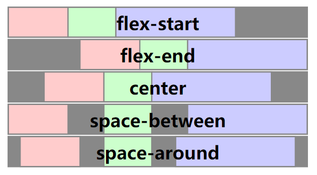
The CSS justify-content property defines how Weex distributes space between and around content items along the main-axis of a flex container. The default value is flex-start.
| Property | Describe |
|---|---|
| flex-start | The items are packed flush to each other toward the edge of the alignment container depending on the flex container's main-start side. |
| flex-end | The items are packed flush to each other toward the edge of the alignment container depending on the flex container's main-end side. |
| center | The items are packed flush to each other toward the center of the alignment container along the main axis. |
| space-between | The items are evenly distributed within the alignment container along the main axis. The spacing between each pair of adjacent items is the same. The first item is flush with the main-start edge, and the last item is flush with the main-end edge. |
| space-around | It indicates equal intervals on both sides of flex member items, so the interval between member items is twice as large as the interval between member items and borders |
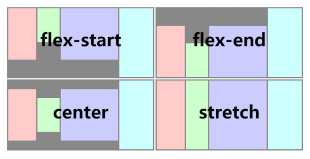
The CSS align-items property sets the align-self value on all direct children as a group. It controls the alignment of items on the cross Axis. The default value is stretch.
| Property | Describe |
|---|---|
| stretch | Flex items are stretched such that the cross-size of the item's margin box is the same as the line while respecting width and height constraints. |
| flex-start | The cross-start margin edges of the flex items are flushed with the cross-start edge of the line. |
| flex-end | The cross-end margin edges of the flex items are flushed with the cross-end edge of the line. |
| center | The flex items' margin boxes are centered within the line on the cross-axis. |
The flex property specifies the length of the flex item, relative to the rest of the flex items inside the same container.
注意
Flex member item does not support flex-shrink, flex-basis, align-content attributes temporarily.
That attribute does not support flex: Abbreviation for flex-grow | flex-shrink | flex-basis.
	<!-- Grid layout -->
	<template>
		<view>
			<view v-for="(v, i) in list" class="row">
				<view v-for="(text, k) in v" class="item">
					<view>
						<text>{{text}}</text>
					</view>
				</view>
			</view>
		</view>
	</template>
	<script>
		export default {
			data() {
				return {
					list: [
						['A', 'B', 'C'],
						['D', 'E', 'F'],
						['G', 'H', 'I']
					]
				}
			}
		}
	</script>
	<style scoped>
	.row {
		flex-direction: row;
		height: 80px;
	}
	.item {
		flex: 1;
		justify-content: center;
		align-items: center;
		border-width: 1;
		border-style: solid;
		border-color: #FFFFFF;
		background-color: #00AAFF;
	}
	</style>
	<!-- Contour module -->
	<template>
	  <view>
	    <view style="width:300px; height:100px;">
	      <view style="flex: 1;background-color:blue"></view>
	      <view style="flex: 1;background-color:red"></view>
	      <view style="flex: 1;background-color:yellow"></view>
	    </view>
	  </view>
	</template>
Set the positioning type. The default value is relative.
| Property | Describe |
|---|---|
| relative | is the default value and refers to relative localization |
| absolute | Absolute localization, with the container of the element as the reference system |
| fixed | Fixed localization, ensure that the element is displayed in the corresponding position in the page window, even if the window is scrolling, it will not move |
| sticky | It means that only when the element is scrolled out of the page, the element will be fixed at the top of the page window, achieving sticky effect/sticky localization (layout). |
Use position:sticky or position: fixed can fix the head navigation bar (sticky effect)
	<!-- Center horizontally and vertically -->
	<template>
		<view class="wrapper">
			<view class="box"></view>
		</view>
	</template>
	<style scoped>
		.wrapper{
			position: absolute;
			top: 0;
			right: 0;
			bottom: 0;
			left: 0;
			background-color: #cccccc;
			justify-content: center;
			align-items: center;
		}
		.box{
			width: 200px;
			height: 200px;
			background-color: #fc0000;
		}
	</style>
Only for Android
If your component is bigger than its parent, it will be partial invisible as Weex on Android only supports overflow:hidden.
transition允许 CSS 的属性值在一定的时间区间内平滑地过渡。
transition allows CSS property values to transition smoothly within a certain time interval.
Allows the name of the transitional animation to set the value of the different styles transition effect, the default value is empty, that does not perform any transition, the following table lists all the legitimate parameters of the property:
| Property | Describe |
|---|---|
| width | The transition is performed when the width of the component is involved in the animation |
| height | The transition is performed when the height of the component is involved in the animation |
| top | The transition is performed when the top of the component is involved in the animation |
| bottom | The transition is performed when the bottom of the component is involved in the animation |
| left | The transition is performed when the left of the component is involved in the animation |
| right | The transition is performed when the right of the component is involved in the animation |
| background-color | The transition is performed when the backgroundColor of the component is involved in the animation |
| opacity | The transition is performed when the opacity of the component is involved in the animation |
| transform | The transition is performed when the transform of the component is involved in the animation |
Specifies the duration of the transition (in milliseconds). The default value is 0, indicating that there is no animation.
Specifies the time interval (in milliseconds or seconds) between the request transition and the transition. The default value is 0, indicating that there is no delay, and the transition is performed immediately after the request.
Describes the velocity curve of the transition, which is used to make the transition smoother. The default is ease. The following table lists all the valid attributes:
| Property | Describe |
|---|---|
| ease | The transition gradually slow down the transition effect |
| ease-in | The transition starts slowly and then becomes faster for the transition effect |
| ease-out | The transition starts quickly and then slows the transition effect |
| ease-in-out | The transition starts slowly, then goes fast and then slowly ends the transition effect |
| linear | The transition changes at constant speed |
| cubic-bezier(x1, y1, x2, y2) | Using the custom transition in the third-order Bessel function, the parameter values of the function must be between 0 and 1. For more information on three times Bessel, see cubic-bezier and Bézier curve. |
<template>
	<view class="row">
		<view class="box" :class="{'active':isActive}" @click="isActive = !isActive">
			<image class="img" src="https://qiniu-web-assets.dcloud.net.cn/unidoc/zh/loveIcon.png" mode="aspectFill"></image>
		</view>
	</view>
</template>
<script>
	export default {
		data() {
			return {
				"isActive":false
			}
		}
	}
</script>
<style scoped>
	.row{
		align-items: center;
		justify-content: center;
	}
	.box{
		margin:20px;
		align-items: center;
		justify-content: center;
		border-radius: 10px;
		width:200rpx;
		height:200rpx;
		background-color: #007AFF;
		transition-property: width, height, background-color;
		transition-duration:0.3s;
		transition-delay:0.1s;
		transition-timing-function: cubic-bezier(0.25, 0.1, 0.25, 1.0);
	}
	.active{
		width:300rpx;
		height:300rpx;
		background-color: #6bd8ff;
	}
	.img{
		width:80rpx;
		height:80rpx;
	}
</style>
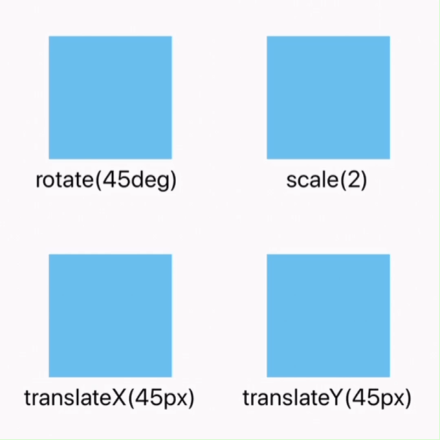
Applied in the 2D or 3D transformation of elements. This attribute allows the rotation, scaling, moving, tilting and so on of the element.
| Property | Describe |
|---|---|
translateX({<length/percentage>}) | X-axis direction panning, length unit or percentage is supported. |
translateY({<length/percentage>}) | Y-axis direction panning, length unit or percentage is supported. |
translate({<length/percentage>} {<length/percentage>}) | X-axis and y-axis directions are simultaneously translated, translateX + translateY abbreviation. |
scaleX(<number>) | X-axis direction scaling, in numeric value, indicates scaling ratio. Percentage is supported. |
scaleY(<number>) | Y-axis direction scaling, in numeric value, indicates scaling ratio. Percentage is supported. |
scale(<number>) | X-axis and Y-axis directions are zoomed simultaneously, scaleX + scaleY abbreviation. |
rotate(<angle/degree>) | The transformation that rotates the element around a fixed point (specified by the transform-origin attribute) without deformation. The specified angle defines the measure of rotation. If the angle is positive, rotate clockwise; Otherwise, rotate counterclockwise. |
rotateX(<angle/degree>) | Rotation in the X-axis direction. |
rotateY(<angle/degree>) | Rotation in the Y-axis direction. |
rotateZ(<angle/degree>) | Rotation in the Z-axis direction. |
perspective(<length>) | Specify the distance between the observer and the z=0 plane, which makes the elements with three-dimensional position transformation produce perspective effect. The three-dimensional elements with z>0 are larger than the normal ones, and those with z<0 are smaller. The size is determined by the value of this attribute. Supported by Android 4.1+. |
transform-origin {length/percentage/keyword (top/left/right/bottom)}: | Set the origin of an element deformation, which only supports 2D coordinates. |
Consider use
transitioninstead, which supports all the style thattransformsupports except fortransform-originandperspectiverotateis the same asrotateZ.
<template>
	<view class="card">
		<view class="box">
			<view class="row-box">
				<view @click="isRotate = !isRotate" class="fill row-rotate " :class="{'rotate':isRotate}"></view>
			</view>
			<text>rotate(45deg) </text>
		</view>
		<view class="box">
			<view class="row-box">
				<view @click="isScale = !isScale" class="fill row-scale" :class="{'scale':isScale}"></view>
			</view>
			<text>scale(2)</text>
		</view>
		<view class="box">
			<view class="row-box">
				<view @click="isTranslateX = !isTranslateX" class="fill row-translateX" :class="{'translateX':isTranslateX}"></view>
			</view>
			<text>translateX(45px)</text>
		</view>
		<view class="box">
			<view class="row-box">
				<view @click="isTranslateY = !isTranslateY" class="fill row-translateY" :class="{'translateY':isTranslateY}"></view>
			</view>
			<text>translateY(45px)</text>
		</view>
	</view>
</template>
<script>
	export default {
		data() {
			return {
				"isRotate": false,
				"isScale":false,
				"isTranslateX":false,
				"isTranslateY":false
			}
		},
	}
</script>
<style>
	.card {
		width:710rpx;
		margin:20rpx;
		flex-direction:row;
		flex-wrap: wrap;
	}
	.box{
		width:355rpx;
		height:355rpx;
		justify-content: center;
		align-items: center;
	}
	.row-box{
		width:200rpx;
		height:200rpx;
		margin:10rpx;
		background-color: #DDDDDD;
	}
	.fill{
		width:200rpx;
		height:200rpx;
		position: relative;
		background-color: #03A9F4;
		opacity: 0.5;
	}
	.row-rotate{
		transition-duration:0.3s;
		transform:rotate(0deg);
	}
	.rotate{
		transition-duration:0.3s;
		transform:rotate(45deg);
	}
	.row-scale{
		transition-duration:0.3s;
		transform:scale(1);
	}
	.scale{
		transform:scale(2);
	}
	.row-translateX{
		transition-duration:0.3s;
		transform:translateX(0px);
	}
	.translateX{
		transform:translateX(45px);
	}
	.row-translateY{
		transition-duration:0.3s;
		transform:translateY(0px);
	}
	.translateY{
		transform:translateY(45px);
	}
</style>
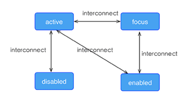
| Property | Describe |
|---|---|
| active | All components are supported |
| focus | Only the input component and textarea component are supported |
| disabled | Only the input component and textarea component are supported |
| enabled | Only the input component and textarea component are supported |
Notes
the high priority override low priority when rules take effect at the same time. such as: "input:active:enabled" will override "input:active".
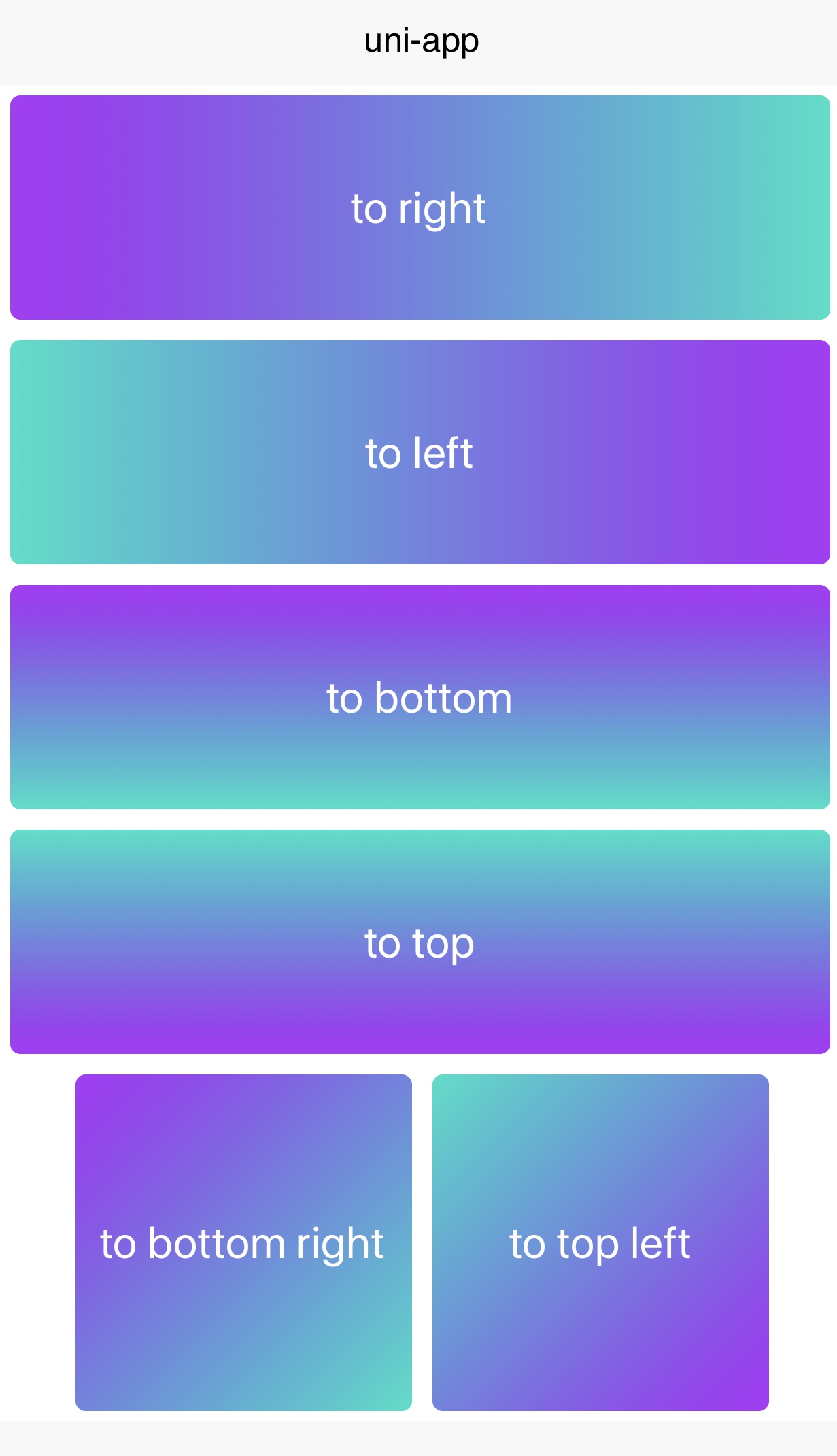
Weex support linear-gradient background, You can see W3C description of the gradient.
You can use linear gradient by background-image property.
background-image:linear-gradient(to bottom right,#AD18F9,#05DFC7);
Weex currently supports two color gradients. The direction of the gradient is as follows:
| Value | Describe |
|---|---|
| to right | From left to right |
| to left | From right to left |
| to bottom | From top to bottom |
| to top | From bottom to top |
| to bottom right | From the upper left corner to the lower right corner |
| to top left | From the lower right corner to the upper left corner |
Notes
background-imagetakes precedence overbackground-color, which means setting bothbackground-imageandbackground-color, ` ``background-coloris overridden.background``` 不支持简写。
radial-gradientis not currently supported, do not use it.
box-shadow{box-shadow:inset offset-x offset-y blur-radius color}
{box-shadow:inset offset-x offset-y blur-radius color}
| Property | Describe |
|---|---|
| inset (optional) | Shadow is outside the border by default. After using inset, the shadow is inside the border (even if it is a transparent border), and below the content above the background. |
| offset-x | Set the horizontal offset, if it is negative, the shadow is located to the left of the element. |
| offset-y | Set the vertical offset, if it is negative, the shadow is located above the element. |
| blur-radius | Set the blur radius, px unit length value, the larger the value, the larger the blur area, and the bigger and lighter the shadow. Cannot be negative. The default value is 0, and the shadow edge is sharp at this value. |
| color | Set shadow color |
Example
	.box4 {
	    box-shadow: inset 3px 5px 20px rgb(255, 69, 0);
	}
Notes
从HBuilderX3.4.3起,重新支持阴影样式(box-shadow)。修复老版本组件设置box-shadow后在不同系统版本出现的显示异常及闪烁问题! 但需要注意设置阴影样式(box-shadow) 的组件需要让出阴影渲染位置,否则会出现阴影显示不全的问题。
Example
<template>
	<view class="wrapper">
		<view>
			<view class="box">
				<text class="title" style="text-align: center">Hello World</text>
			</view>
		</view>
	</view>
</template>
<style>
	.box {
		width: 300px;
		height: 100px;
		background-color: #FFE4C4;
		border-radius: 10px;
		box-shadow: 3px 5px 2px rgb(255, 69, 0);
	}
</style>
elevationAt present, the Android platform's support for the shadow style (box-shadow) is not perfect, and there are problems such as abnormal display of the shadow style when setting a rounded border, and occupying the rendering area of the component view.
To solve these problems, from HBuilderX 2.4.7+, the elevation attribute ( attribute of the component, not css style) is added to set the level of the component and the Number type. The larger the level value, the more obvious the shadow. The shadow effect is also related to the position of the component, the closer to the bottom of the page, the more obvious the shadow effect
Usage
<view elevation="5px"></view>
elevation attribute cannot be modified temporarilyelevation, the level of the current component will be higher than that of other components without elevation. The larger the value range of elevation, the higher the level! Be aware of component coverage scenarioselevation attribute and the shadow style (box-shadow), the box-shadow style becomes invalid after setting the elevation attributeelevation, the parent element of the shadow element needs to be larger than the shadow range, or otherwise the shadow will be clippedelevation attribute, please use box-shadow to set the shadowbox-shadow requires the current component to yield the shadow position. Otherwise, the shadow cannot be seen normallycolor {color}:文字颜色,支持如下字段:
Only
texttags can set the font color
font-size: <length> this property specifies the size of the font.
font-style: <enum> normal | italic. This property lets you select italic or normal faces within a font-family. Default value is normal.
This property indicate the weight of the text.
normal, bold, 100, 200, 300, 400, 500, 600, 700, 800, 900normal is equivalent to 400, bold is equivalent to 700;lighter, bolder, number unit are not supported.text-decoration {string}:字体装饰。默认值为 none。
text-decoration {string}: Font decoration. The default value is none.
| Property | Describe |
|---|---|
| none | Default. Define standard text |
| underline | Define a line below the text |
| line-through | Define a line through the text |
只支持
text和richtext
text-decoration:overlinenot supported
text-align {string}:对齐方式。默认值为 left。
text-align {string}: The alignment. The default value is left.
| Property | Describe |
|---|---|
| left | Align the text to the left |
| center | Align the text to the middle |
| right | Align the text to the right |
text-align:justifynot supported
font-family {string}:设置字体。这个设置不保证在不同平台,设备间的一致性。
```font-family {string}````: Set the font. This setting does not guarantee consistency between devices on different platforms.
If the specified font cannot be found at the device, a typeface fallback will occur and the default typeface will be load. The fallback mechanism may vary in different devices.
If you need to load custom fonts, please refer to the relevant DOM.addRule
text-overflow {string}:设置内容超长时的省略样式。
```text-overflow {string}````: Set the omission style when the content is too long.
| Property | Describe |
|---|---|
| clip | Trimmed text |
| ellipsis | Display ellipsis to represent the trimmed text |
Only
textandrichtextare supported
lines {number}: 正整数,指定最大文本行数,默认lines值为0,表示不限制最大行数lines。如果文本不够长,实际展示行数会小于指定行数。
lines {number}: A positive integer, specifying the maximum number of text lines, the default lines value is 0, which means that the maximum number of lines is not limited lines. If the text is not long enough, the actual number of displayed lines will be less than the specified number of lines.
line-height: <length> The line height of every line in the text. line-height is the space between top and bottom.
line-height与font-size没有关系,因为line-height被 top 和 bottom 所限制,
line-height``` has nothing to do with font-size, because line-heightis limited by top and bottom,font-size 被 glyph 所解析。line-height和font-size相等一般会导致文字被截断。 font-size is parsed by glyph. Equal ``line-height and font-size will generally cause text to be truncated.
word-wrap:<string> 对nvue来说 anywhere 表示在以字符为最小元素做截断换行,其它值或不指定该属性,都以英文单词为单位进行换行。
word-wrap:<string> For nvue, anywhere means that the character is the smallest element to truncate and wrap the line. Other values or not specifying this attribute are performed in English words. newline.
| Property | Describe |
|---|---|
| break-word | Line feed inside long words or URL addresses |
| normal | Line feed only at allowed hyphenation points |
| anywhere | Use characters as the smallest element to do truncation and line feed |
在 Android 平台暂不支持